FIGR_HELOC$1.04▲ 0.48%XAG$62.82▲ 4.54%BRENT$86.11▼ 19.63%COIN$165.51▲ 3.94%WBT$56.18▲ 0.89%META$582.94▼ 4.89%XLM$0.2020▲ 0.92%HYPE$70.13▲ 6.87%LEO$9.15▲ 0.25%DOGE$0.0766▲ 3.20%AAPL$308.67▲ 4.85%MSTR$100.80▲ 7.93%ZEC$457.66▲ 4.67%RAIN$0.0155▼ 0.44%NFLX$77.67▲ 4.69%GOOGL$359.95▼ 0.35%TRX$0.3203▲ 0.77%ETH$1,734.31▲ 2.20%WTI$85.52▼ 16.26%TSLA$393.49▼ 7.48%XRP$1.12▲ 2.56%BNB$567.28▲ 1.03%NATGAS$3.14▲ 6.80%NVDA$194.86▼ 1.38%USDS$0.9996▼ 0.01%SOL$81.57▲ 0.97%AMZN$242.71▲ 0.42%XAU$4,187.30▲ 2.93%BTC$62,179.00▲ 0.77%MSFT$390.53▲ 1.63%FIGR_HELOC$1.04▲ 0.48%XAG$62.82▲ 4.54%BRENT$86.11▼ 19.63%COIN$165.51▲ 3.94%WBT$56.18▲ 0.89%META$582.94▼ 4.89%XLM$0.2020▲ 0.92%HYPE$70.13▲ 6.87%LEO$9.15▲ 0.25%DOGE$0.0766▲ 3.20%AAPL$308.67▲ 4.85%MSTR$100.80▲ 7.93%ZEC$457.66▲ 4.67%RAIN$0.0155▼ 0.44%NFLX$77.67▲ 4.69%GOOGL$359.95▼ 0.35%TRX$0.3203▲ 0.77%ETH$1,734.31▲ 2.20%WTI$85.52▼ 16.26%TSLA$393.49▼ 7.48%XRP$1.12▲ 2.56%BNB$567.28▲ 1.03%NATGAS$3.14▲ 6.80%NVDA$194.86▼ 1.38%USDS$0.9996▼ 0.01%SOL$81.57▲ 0.97%AMZN$242.71▲ 0.42%XAU$4,187.30▲ 2.93%BTC$62,179.00▲ 0.77%MSFT$390.53▲ 1.63%
Prices as of 17:15 UTC

Author: Andy K.

  • Micron’s $1 Trillion: What the AI Memory Cycle Actually Shows

    Micron’s $1 Trillion: What the AI Memory Cycle Actually Shows

    On May 26, Micron Technology’s market capitalization crossed $1 trillion for the first time in the company’s history after shares surged 19 percent in a single session. The catalyst was a UBS analyst upgrade that tripled the price target — from $535 to $1,625 per share — citing a supply-demand imbalance in high-bandwidth memory that the analyst described as structurally durable. Micron’s stock closed at approximately $1,125, bringing the company into an exclusive group: the only memory chipmaker, and one of the few semiconductor companies of any kind, to achieve the ten-figure market cap milestone. As of that close, Micron’s shares had risen roughly ten times from their May 2025 level. The market had required about 12 months to reprice a company that had been building the memory architecture underlying every major AI system in production.

    The 12-month delay is the story. Micron has been a critical supplier in AI infrastructure for longer than the stock price reflected. High-bandwidth memory — a chip architecture that stacks DRAM dies and connects them with through-silicon vias to achieve dramatically higher bandwidth than conventional memory — is not optional for AI training or inference at scale. It is the architecture that allows a GPU to be fed data fast enough to utilise its compute capacity. Without HBM, a Nvidia H100 or B200 processes at a fraction of its theoretical throughput. Micron, Samsung, and SK Hynix are the only companies in the world that manufacture it. In the current AI infrastructure cycle, Micron’s 2026 HBM production was sold out before the calendar year began.

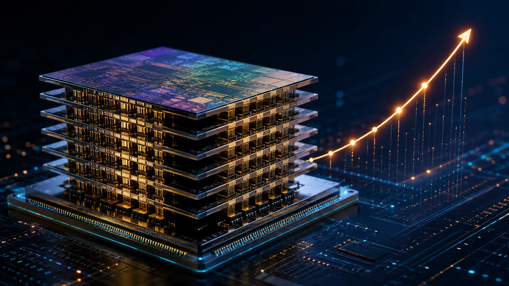
    What High-Bandwidth Memory Actually Does

    The standard computer memory architecture — DDR5 DRAM in a consumer PC, LPDDR5 in a mobile device — sends data through a relatively narrow interface between the memory chip and the processor. For most computing workloads, this bandwidth is sufficient. AI model training is not most workloads. A large language model training run requires moving hundreds of billions of parameters repeatedly through the system, and the limiting factor in that process is typically not the GPU’s ability to perform mathematical operations — it is the speed at which data can be delivered to the GPU in the first place.

    High-bandwidth memory addresses this by physically placing memory and logic closer together and using a wide, short interconnect — a silicon interposer — that achieves data transfer rates orders of magnitude beyond what a standard memory interface can manage. HBM3E, the current generation, delivers up to 1.28 terabytes per second of bandwidth per stack. A Nvidia H100 uses six HBM2e stacks; the B200 uses eight HBM3e stacks. The memory is co-packaged with the GPU on a multi-chip module. It cannot be substituted with standard DRAM. And the supply chain for producing it runs through three companies.

    That supply constraint has been visible in industry channel checks for over a year. Micron, in its most recent earnings call before the UBS upgrade, disclosed that customer commitments for HBM had already secured the company’s entire production capacity through the end of 2026. The comment passed with moderate analyst coverage and a stock price that, in retrospect, had not yet repriced the scarcity premium that the commitment implied.

    The UBS Upgrade and What It Represents

    UBS’s May 26 upgrade did not introduce new information about Micron’s fundamental business. The analyst report cited the same HBM supply dynamics that had been visible in Micron’s own disclosures. What changed was the analyst’s willingness to apply a valuation multiple to those dynamics that reflected their structural character rather than treating them as cyclical. Memory semiconductors have historically been valued as commodity businesses — capacity investments lead to oversupply, oversupply compresses margins, margins compress valuations. The cycle repeats. The argument embedded in the $1,625 price target is that HBM is not a commodity in the conventional sense, because the manufacturing process is proprietary, the qualification period for new supply is measured in years rather than months, and AI infrastructure demand is growing faster than the industry’s capacity to add qualified HBM production.

    If that argument is correct — and Micron’s sold-out 2026 production is the most direct available evidence — then the conventional memory valuation framework is the wrong model. The UBS target applied a framework closer to specialty semiconductors: scarce capacity, differentiated product, durable pricing power. At that framework, Micron at $1.625 per share represents a different risk-reward than Micron at $535, even though the underlying business is the same. The market’s 19 percent response to the upgrade reflects the re-rating of the analytical framework itself, not just the specific number.

    The context Jensen Huang’s $3 trillion AI infrastructure build-out framing provides is the scaffolding that makes the Micron re-rating legible. If AI infrastructure spending is measured in trillions over the coming decade, and if HBM is a required component of every GPU deployed in that infrastructure, and if only three companies can manufacture it, then the portion of that spending that flows to memory is not a marginal allocation. It is structural. The question was whether the equity market would price it as such. The May 26 session answered that question.

    A Year That Added $900 Billion in Market Value

    Micron’s progression from approximately $108 billion in May 2025 to $1.01 trillion in May 2026 is among the most significant value-creation events in the semiconductor industry’s recent history. For scale: the gain in market capitalisation over that period — roughly $900 billion — exceeds the total market cap of most S&P 500 companies. It took Micron approximately 46 years from its founding in 1978 to reach a $100 billion valuation and roughly 12 months to add nine times that amount.

    The comparative context within the semiconductor sector is useful. Nvidia’s re-rating from an underappreciated GPU company to a $3+ trillion AI infrastructure monopolist preceded Micron’s by approximately 18 to 24 months. Both stories share the same underlying dynamic: a component in AI infrastructure supply chains that had been priced on historical earnings rather than structural forward demand. Nvidia was repriced first because its GPUs are the visible layer of AI infrastructure — the systems that data centres buy, the products that generate the headlines. Micron’s HBM is invisible from the outside; it lives inside the GPU package and does not generate its own product announcements. The market needed Nvidia’s re-rating to fully land before it could begin repricing the components that Nvidia’s products depend on.

    The S&P 500 closed at a record 7,519 on May 25 in part because of the momentum from semiconductor stocks. The VanEck Semiconductor ETF reached a new 52-week high in the same session. The concentration question embedded in that move — how much of the market’s record high reflects a handful of AI infrastructure companies, and how much reflects broad economic health — is one that the S&P 500’s simultaneous equity-bond correlation breakdown already complicates. An index record driven by trillion-dollar semiconductor stocks in a period when 10-year Treasuries are also falling is not the same macro signal as a record driven by broad earnings growth.

    Samsung and SK Hynix: The Other Half of the Story

    Micron’s milestone does not exist in isolation. Samsung Semiconductor and SK Hynix are the other two manufacturers capable of producing HBM at scale. SK Hynix has historically been the most advanced in HBM development — it was the first to produce HBM3 commercially and has maintained a technology lead in successive generations. Samsung has been attempting to close the gap but faced quality control and yield issues with its HBM3e production in 2025 that led Nvidia to delay qualification of Samsung’s supply.

    The competitive dynamics within the HBM oligopoly matter for understanding Micron’s position. If SK Hynix holds the technology lead and Samsung’s yield issues persist, Micron is positioned as the swing supplier — the company with the capacity to absorb demand that a two-player market would otherwise constrain. AI data centre operators do not want a single-supplier dependency on SK Hynix; Micron’s qualification as a second high-volume HBM source is therefore strategically valuable to buyers in ways that exceed its share of total production.

    The geopolitical dimension compounds this. Samsung and SK Hynix are South Korean companies with manufacturing footprints exposed to East Asian supply chain risks. Micron is the only HBM producer domiciled in the United States with significant US-based manufacturing capacity — a characteristic that has become commercially relevant as data centre operators consider supply chain resilience in their procurement decisions. The CHIPS Act investments that encouraged Micron to expand US-based production capacity were not purely altruistic government subsidies. They were supply chain insurance for buyers who cannot afford a memory supply disruption during an AI infrastructure build of this scale.

    The Concentration Risk Question

    The ten-fold price increase in 12 months generates a question that any investor in Micron or the broader semiconductor sector should engage with: what is the margin of error on the HBM scarcity thesis, and what happens to the valuation if demand growth slows or supply capacity expands faster than expected?

    The bull case is structurally sound for 2026 and probably 2027. Micron’s sold-out production is not a projection — it is a disclosed fact, reflected in customer commitments already on the books. The capacity to add meaningful new HBM production is constrained by the lead time required to build and qualify advanced memory fabrication lines, which runs to 24 to 36 months from investment decision to commercial output. Any capacity expansion decision made today would produce qualifying supply in 2028 at the earliest. For the near term, scarcity is not a risk. It is the operating reality.

    The medium-term risk is different. AI training runs will eventually plateau at some efficiency frontier. Inference workloads are less memory-bandwidth-intensive than training. The shift from primarily training to primarily inference in the AI compute mix — which is widely expected as model development matures and deployment scales — would change the memory demand profile in ways that are not yet visible in current procurement patterns. A $1 trillion valuation priced on 2026 dynamics assumes those dynamics persist for long enough to justify the multiple. That assumption is reasonable for the near term. It is not risk-free over a five-year horizon.

    For now, the market has decided to price Micron as a structural winner in the AI infrastructure cycle. The evidence that supports that pricing — sold-out 2026 capacity, a UBS target that doubled the market’s implied valuation, the S&P 500 responding with a record close — arrived in a single session on May 26. Twelve months ago, the same underlying supply dynamics were visible in the company’s own disclosures. The difference between May 2025 and May 2026 is not the facts. It is the market’s willingness to price them.

    What It Means for the AI Infrastructure Investment Thesis

    Micron’s trillion-dollar milestone completes a picture that has been assembling since early 2024. The AI infrastructure investment cycle has produced a specific group of structural winners: companies that supply essential, scarce, non-substitutable components to an exponentially growing build-out. Nvidia is the clearest example. TSMC, which manufactures the most advanced chips that Nvidia designs, is the second. Micron is now the third member of this group to receive a trillion-dollar equity valuation from the market.

    The implications for portfolio construction are not subtle. An index that includes Nvidia, TSMC, and Micron as trillion-dollar weightings is structurally concentrated in AI infrastructure supply chains in a way that has no historical precedent in the semiconductor sector. The question of whether that concentration reflects genuine value creation — the infrastructure spending is real, the demand is real, the supply constraints are real — or a speculative re-rating that has outrun the underlying economics is the central question for technology investors in the second half of 2026.

    The 19 percent single-session move on May 26 makes the question more acute. Markets that move 19 percent in a day on analyst target upgrades are not reflecting slow-moving fundamental value recognition. They are reflecting the abrupt repricing of a framework — the shift from commodity memory valuation to specialty semiconductor valuation — in response to an articulation that the market found compelling. That repricing can be correct and still carry significant volatility risk. Micron at $1 trillion is not the same investment proposition as Micron at $108 billion. The thesis that justified the initial position — undervalued critical supplier — has been validated. The question now is whether the $1 trillion valuation has room to grow from here or whether it reflects the thesis having fully arrived.

    What the Micron Milestone Actually Reveals About the AI Trade

    Scott Galloway has a consistent frame for trillion-dollar market cap moments: they represent the market’s collective verdict on which layer of the technology stack is capturing the most durable value, and they are usually most useful as contrarian signals about where the next phase of value migration will occur. Micron crossing a trillion dollars on the back of HBM scarcity is a statement about where the AI value chain is right now — constrained at the memory layer, with the constraint temporarily accruing to a manufacturer who cannot increase production fast enough to meet demand. The question is whether that constraint is structural or cyclical, and the history of semiconductor memory strongly suggests the answer is cyclical.

    The HBM production sellout for 2026 is the most important specific in the story. It is simultaneously a real demand signal and a historical warning. Memory semiconductor markets have oscillated between capacity constraint and catastrophic oversupply more consistently than almost any other technology market. The constraint phase generates massive returns for producers; the oversupply phase destroys them. The 2026 HBM sellout is pricing the constraint phase as permanent, or at least durable enough to justify a trillion-dollar valuation. Samsung and SK Hynix’s aggressive capacity expansion plans, combined with Micron’s own production scaling, suggest the constraint phase may be considerably shorter than the current valuation implies.

    The AI infrastructure layer where Micron competes is distinct from the software layer where the bulk of AI value is still being contested. Enterprise AI adoption at 3.3% Copilot penetration means the software application layer has not yet captured the user base that the hardware layer is being built to serve. That is the classic infrastructure paradox: the infrastructure is built in anticipation of demand that materializes slower than the buildout implies, and the timing mismatch creates the conditions for the oversupply cycle. Micron’s 2026 sold-out production is the demand phase. Whether demand sustains at the level required to absorb the production that will come online in 2027 and 2028 is the question the current valuation needs to answer.

    The broader datacenter equipment cycle provides the comparative context. Vertiv, Eaton, and Schneider are all trading at elevated multiples on the same logic as Micron — their products are constrained because datacenter build-out is constrained, and the backlog implies years of demand visibility. What that analysis consistently undercounts is the role of supply response: constrained infrastructure markets attract capital, capital funds new production, new production eventually exceeds demand, and the margin compression arrives before anyone forecasted it. The semiconductor memory industry has run this cycle four times in twenty years. Each time, the participants closest to the peak believed the constraint was structural. Each time, the supply response proved them wrong.

    The Chinese AI development trajectory adds a demand uncertainty that the production sellout narrative does not incorporate. DeepSeek demonstrated that inference efficiency can be dramatically improved through algorithmic innovation — that a model can produce comparable outputs at a fraction of the compute cost of its predecessors. If the trend toward inference efficiency continues, the amount of HBM required per AI workload may decline over the same period that new HBM production is coming online. The supply response and the efficiency curve compound: more HBM available, less HBM required per workload, and the demand assumptions embedded in the 2026 valuation are being revised from both directions simultaneously.

    Galloway’s trade on trillion-dollar milestone moments is usually to ask what the milestone is masking rather than what it is announcing. The Micron milestone is announcing constrained HBM supply and surging AI training demand. What it is masking is the supply response already underway, the efficiency curves already being demonstrated, and the corporate capital allocation patterns that show hyperscalers beginning to moderate capex guidance even as their AI revenue ramps. Prediction markets on Micron’s 2027 earnings versus 2026 consensus are priced more cautiously than the stock — which is the market’s honest assessment of how durable the HBM constraint actually is.

  • The S&P 500 Is at Record Highs. Bonds Are Falling Too. Why the 60/40 Portfolio Is Breaking Down in 2026.

    The S&P 500 Is at Record Highs. Bonds Are Falling Too. Why the 60/40 Portfolio Is Breaking Down in 2026.

    The S&P 500 closed April 2026 at 7,209 — an all-time record, marking the strongest monthly gain the index has delivered since 2020. Corporate earnings have been exceptional: 84% of reporting S&P 500 companies beat EPS estimates in Q1, with blended year-over-year growth running at 15.1% and an average beat magnitude of 12.3%, compared to the five-year average beat of 7.3%. By any traditional measure, this should be an unambiguous bull market. Yet the portfolio framework that has served investors for four decades is quietly fracturing — and the fracture is not about stocks at all. It is about bonds.

    Since Iran closed the Strait of Hormuz in late February 2026, US 10-year Treasury returns have been negative. Stocks and long-term bonds have been selling off together. The correlation that underpins the 60/40 portfolio — the assumption that when equities fall, fixed income rises — has flipped positive. And if that correlation shift is not temporary, the implications for how institutional and retail investors construct portfolios are profound.

    Understanding the Correlation That Built the 60/40 Model

    The 60/40 portfolio — 60% equities, 40% bonds — became the default institutional allocation framework in the 1980s and held its dominance through the 1990s, 2000s, and 2010s. Its logic rested on a single empirical observation: stocks and bonds tend to move in opposite directions. When equities sell off in a growth scare or recession, investors flee to the safety of government bonds, driving bond prices up and yields down. That negative correlation meant bonds provided a genuine hedge — the 40% of the portfolio that would absorb losses when the 60% was bleeding.

    That correlation held reliably from approximately 1998 through 2021. It was not a coincidence or a structural rule; it was a product of a specific macro regime: low and falling inflation, a Federal Reserve that responded to economic weakness by cutting rates, and a global demand for safe assets that made US Treasuries the default refuge in a crisis. In that environment, the 60/40 portfolio worked because the macroeconomic and monetary policy conditions made it work.

    That regime is now under stress. And the stress has a specific cause.

    What the Strait of Hormuz Closure Did to the Macro Environment

    Iran’s decision to close the Strait of Hormuz in late February 2026 was a geopolitical event with direct economic consequences. Approximately 20% of the world’s oil supply transits the Strait. Its closure created an immediate supply disruption, driving energy prices sharply higher and — critically — in a way that is not easily offset by demand destruction alone. Unlike a demand shock, which tends to be deflationary, a supply shock pushes prices up while simultaneously squeezing real economic output. The result is the precise combination that central bankers find most difficult to navigate: rising prices and slowing growth, or stagflation.

    The stagflation signal matters enormously for the stock-bond correlation. In a standard deflationary recession, the Fed cuts rates, bond prices rise, and the negative correlation between stocks and bonds is reinforced. In a stagflationary environment, the Fed faces a dilemma: cut rates to support growth (and risk entrenching higher inflation) or hold rates or hike (and risk a sharper economic slowdown). The Fed has chosen to hold steady thus far, but PCE data has delivered an upside surprise in core inflation, and markets are beginning to price in a rate hike rather than a cut. That repricing is the mechanism through which bonds become correlated with stocks: if the Fed hikes in response to inflation, bond prices fall as yields rise — and equity multiples compress at the same time, bringing stocks down too.

    The result is a market where the traditional safe-haven properties of US government bonds are no longer reliable. Bonds are not rallying when stocks wobble. They are falling alongside them. The hedge has broken down.

    The Earnings Picture: Strong Results, Compressed Multiples Ahead

    The S&P 500’s record high at 7,209 is not a market that has lost touch with fundamentals entirely. The earnings data behind it is genuinely strong. Q1 2026 delivered blended EPS growth of 15.1% year over year, well above the five-year average, with 84% of reporters beating estimates. According to FactSet’s Q1 2026 Earnings Scorecard, the average beat magnitude of 12.3% is nearly double the historical norm of 7.3% — a signal of operating leverage, not just financial engineering.

    The operating lever story makes sense in the current environment. Labour productivity gains from AI adoption have compressed cost structures for many companies. Revenue growth has held up as nominal GDP remains elevated (partly due to higher price levels rather than purely real demand growth). Companies with strong pricing power — particularly those in the AI infrastructure chain, financials, and energy — have delivered exceptional results.

    But earnings growth and multiple expansion are different things. The S&P 500 at 7,209 embeds a forward P/E multiple that was sustainable when the risk-free rate was falling or stable. If the Fed hikes rates, the discount rate applied to future cash flows rises, and equity multiples face compression. The market can deliver excellent earnings growth and still see prices fall if the multiple applied to those earnings contracts. This is the central tension in the current market: fundamentals are strong, but the macro environment that determines how those fundamentals are valued is deteriorating.

    The earnings divergence is also not uniform. As explored in the analysis of the earnings divergence between AI capex spenders and non-spenders, the S&P 500’s aggregate headline growth masks a bifurcation between companies actively deploying AI capital and those that are not. The former group is driving the bulk of the earnings beat; the latter is seeing more modest performance.

    The Historical Parallel: 1970s Stagflation

    The last time the stock-bond correlation turned persistently positive was the 1970s. The parallel is instructive and uncomfortable. During the stagflation episode of the mid-to-late 1970s, both stocks and bonds suffered in real terms. Nominal returns were occasionally positive, but inflation eroded purchasing power consistently. The 60/40 portfolio not only failed to provide protection — it delivered negative real returns for extended periods.

    The drivers of 1970s stagflation were different in origin (oil embargoes, supply shocks, loose fiscal policy) but similar in structure to what is emerging now: an energy supply disruption, an elevated inflation baseline, a central bank facing a credibility test, and a fiscal position (large deficits) that made aggressive monetary tightening politically and economically costly. In that environment, the asset classes that preserved purchasing power were real assets: gold, commodities, real estate with pricing power, and short-duration instruments that repriced quickly as rates rose.

    The 2026 parallel is not identical — AI-driven productivity gains are a deflationary force that did not exist in the 1970s, and the global economy is more interconnected. But the structural logic is the same: when inflation is driven by supply shocks and fiscal deficits simultaneously, bonds do not serve as the hedge they do in demand-driven, low-inflation recessions.

    The Fed’s Position and Rate Hike Pricing

    The Federal Reserve held rates steady at its most recent meeting but issued a warning that inflation risks remain elevated. Core PCE data has confirmed that the warning was not precautionary — it was descriptive. The upside surprise in core inflation reflects, in part, the energy price pass-through from the Strait of Hormuz closure, but also persistent services inflation that has proven stickier than models projected.

    Markets are now pricing in a rate hike as a meaningful probability for the second half of 2026. This is a significant shift. For much of 2025 and early 2026, the rate path was expected to be flat-to-down. The repricing of rate expectations toward a possible hike is directly responsible for the negative bond returns since February. As the stagflation environment and rate hike pricing under the current Fed leadership illustrate, the central bank is navigating a narrow path between inflation credibility and growth support — and the bond market is pricing in the risk that the path narrows further.

    If the Fed hikes, the impact on the 60/40 portfolio is symmetric and negative: long-duration bonds fall as yields rise, and equity multiples compress as the discount rate rises. Both halves of the portfolio face headwinds simultaneously. That is the precise scenario the 60/40 model was designed to avoid — and it is the scenario the current macro environment is generating.

    Gold, Commodities, and What Has Actually Worked

    While stocks and bonds have been selling off together, some asset classes have maintained their portfolio hedge properties. Gold has delivered returns of approximately 37% over the past 12 months — a performance that reflects both its traditional safe-haven demand during geopolitical stress and its role as an inflation hedge when real yields are low or uncertain. Gold’s correlation with stocks has been low to negative over this period, meaning it has provided the diversification benefit that bonds have not.

    Commodities broadly have also outperformed. Energy commodities were the most immediate beneficiary of the Strait of Hormuz closure, but industrial metals and agricultural commodities have also attracted flows as investors seek inflation protection through real asset exposure. Short-duration fixed income instruments — Treasury bills, short-dated TIPS, floating-rate bonds — have outperformed long-duration bonds because they reprice quickly in a rising rate environment rather than suffering mark-to-market losses.

    Real assets more broadly — infrastructure, real estate with contractual rent escalators, commodities production — have demonstrated the inflation-protection properties that long-duration government bonds were supposed to provide. The portfolio implication is that the 40% fixed income allocation in a 60/40 portfolio needs to be reconceived, not simply replaced with more equity. The question is not just what replaces bonds, but what delivers the diversification and inflation protection that bonds are no longer reliably providing.

    What Institutions Are Doing

    Large institutional investors — sovereign wealth funds, pension funds, endowments — have been adjusting allocations ahead of the retail investor recognition of the correlation shift. BlackRock’s Investment Institute weekly commentary for May 2026 has highlighted the breakdown in traditional correlations and the need to rethink portfolio construction for a regime of higher structural inflation and positive supply shocks. Fidelity’s midyear 2026 outlook similarly flags the stock-bond correlation as a key variable to monitor, noting that the macro environment has shifted in ways that make simple 60/40 construction less reliable.

    Crestwood Advisors’ May 2026 economic and market update — titled “New Highs and Old Risks” — captures the tension precisely: the headline numbers (record stock prices, strong earnings) look like a bull market, but the underlying macro risks (persistent inflation, fiscal deficits, geopolitical supply disruptions, positive stock-bond correlation) represent a structural challenge to standard portfolio construction that investors need to address proactively rather than retroactively.

    The institutional response has varied. Some have reduced long-duration bond allocations in favour of short-duration instruments and inflation-linked bonds. Others have increased allocations to real assets, commodities, and alternative strategies that target low correlation with both equities and fixed income. Multi-asset absolute return strategies — which were largely out of favour during the long bull market in both stocks and bonds — are attracting renewed interest as investors seek genuine diversification rather than the apparent diversification of a traditional 60/40 that relies on a correlation assumption that no longer holds.

    The Portfolio Construction Implications

    The breakdown of the stock-bond correlation does not mean the 60/40 portfolio is permanently dead. Correlations are not fixed; they are regime-dependent. If the geopolitical situation resolves, energy prices normalise, and the Fed successfully re-anchors inflation expectations without triggering a hard landing, the conditions that produced negative stock-bond correlation could return. But that is a scenario, not a forecast, and investors who hold a standard 60/40 portfolio are betting that the regime returns before it causes significant damage.

    For investors who want to manage the current risk rather than wait for the regime to shift, several adjustments are relevant. Reducing duration in the bond allocation — moving from long-duration government bonds to short-duration instruments, inflation-linked bonds, or floating-rate credit — reduces the direct interest rate risk while maintaining some fixed income exposure. Adding real asset exposure (gold, commodities, infrastructure) provides inflation protection and genuine portfolio diversification. Considering the equity allocation more carefully — favouring companies with genuine pricing power and real asset exposure over pure-multiple growth stories — reduces the vulnerability to multiple compression if the Fed hikes.

    None of these adjustments is costless. Short-duration bonds offer lower yields than long-duration bonds in a normal yield curve environment. Gold and commodities do not compound at the rate of equities over long periods. Real assets require illiquidity acceptance that is not appropriate for all investors. Portfolio construction under a positive stock-bond correlation regime involves genuine trade-offs that do not exist in the standard 60/40 framework.

    The more important point, however, is recognition. The S&P 500 at 7,209 is not telling investors that everything is fine — it is telling them that the earnings power of corporate America remains strong. Bonds falling at the same time are telling them that the macro environment that made the 60/40 portfolio reliable is under stress. Both signals can be true simultaneously, and the portfolio response to both simultaneously is different from the response to either individually.

    What Comes Next

    The near-term catalysts to watch are straightforward. The Federal Reserve’s next meeting and the rate decision — or guidance around it — will determine whether the rate hike probability priced by markets materialises or fades. Another significant upside surprise in core PCE would increase hike probability and put additional pressure on both long-duration bonds and high-multiple equities. A geopolitical resolution in the Strait of Hormuz, if it materially reduces energy prices, would ease the inflationary pressure and could allow the Fed to hold or cut, restoring some of the conditions that supported negative stock-bond correlation.

    What is less uncertain is the structural context. US fiscal deficits remain large and are not on a path to rapid reduction. Energy transition infrastructure spending is ongoing, not a temporary phenomenon. AI-driven capital investment is additive to aggregate demand in the near term, not dampening. The forces that produce structural inflation pressure — supply disruptions, fiscal deficits, energy system transition — are not resolving quickly. That means the positive stock-bond correlation environment may persist longer than a single geopolitical event cycle would suggest.

    Investors who treat the current environment as a temporary deviation from the 60/40 norm and wait for it to pass are making a directional bet on macro regime restoration. Investors who treat it as a structural shift requiring portfolio adaptation are making a different bet. The data from Q1 earnings, from bond market performance, and from the macro environment described above suggests the structural shift thesis deserves serious weight — even as the S&P 500 continues to print record highs.

    The record high is real. The earnings behind it are real. The risk embedded in the portfolio construction assumption that bonds will hedge it is also real. Those three facts coexist, and navigating all three simultaneously is the portfolio challenge of 2026.

    The Winning Aspiration: Where Does Capital Win When the Correlation Framework Breaks?

    Roger Martin’s strategy framework begins with a single question that practitioners usually resist: where will you choose to play, and why does that choice produce returns? The 60/40 portfolio did not emerge from theory. It emerged from a specific empirical relationship — the negative bond-equity correlation that made Treasuries work as portfolio insurance. When that relationship held, the 60/40 construct was not a strategic choice; it was a risk-management identity. The choice to play had already been made by the macro environment.

    That relationship has now broken. Two assets that were supposed to hedge each other are falling simultaneously. The playing field has changed. The question Martin’s framework forces is not “how do we repair the 60/40?” but “what playing field now produces a defensible position for capital preservation and return?”

    Three candidate fields emerge from this article’s evidence. Gold and commodities have worked — not as a hedge to equity but as an independent source of return when both stocks and bonds are under pressure from the same inflationary force. Short-duration instruments have worked — not because rates have moved in their favour but because they avoid the duration penalty that long Treasuries carry in a rate-hike environment. And selective international equity — India’s equity market, which has produced positive real returns while US bond-equity correlation has broken down — has worked, partly because its correlation to the US bond-equity dynamic is structurally lower.

    None of these is a simple replacement for the 60/40 construct. All of them require a view on which macro environment is actually present: disinflation returning, stagflation persisting, or something else. Martin would note that the strategic error investors are making is not holding the wrong assets — it is failing to choose a playing field at all, and hoping the old framework reasserts itself before the losses compound.

  • Ethereum Restaking and EigenLayer: What Shared Security Actually Means — and What the Risks Are.

    Ethereum Restaking and EigenLayer: What Shared Security Actually Means — and What the Risks Are.

    EigenLayer introduced restaking to the Ethereum ecosystem in 2023 and, in doing so, created one of the most discussed and least fully understood concepts in blockchain infrastructure. The basic idea is straightforward: ETH that has been staked to secure Ethereum can be simultaneously “restaked” — committed to secure additional protocols or services called Actively Validated Services (AVSs) — in exchange for additional yield. The staker takes on additional slashing risk in exchange for additional rewards. The protocol being secured gets Ethereum’s enormous staked capital behind it without needing to bootstrap its own validator set.

    By 2026, the numbers have become meaningful. EigenLayer has accumulated tens of billions of dollars in restaked ETH, making it one of the largest smart contract systems in the Ethereum ecosystem by total value locked. The EIGEN token has been distributed and is trading. The first generation of AVSs — including EigenDA (a data availability service), and several oracle and bridge verification systems — are live and generating restaker rewards.

    The concept works mechanically. The question that deserves more honest examination than the restaking community typically provides is what risks have been introduced into the Ethereum security stack, and whether the additional yield adequately compensates for those risks at the current scale of adoption.

    How Restaking Works: The Mechanics

    Ethereum validators stake 32 ETH to participate in consensus, earning staking rewards (currently around 3 to 4 percent annualised) in exchange for correctly validating transactions and maintaining the network. The staked ETH is subject to slashing — partial confiscation — if the validator behaves dishonestly or negligently (double signing, extended downtime).

    Restaking through EigenLayer extends this commitment. A staker (or liquid staking token holder who has deposited stETH or cbETH into EigenLayer) opts into one or more AVSs. Each AVS has its own slashing conditions — specific behaviours that, if detected, result in partial confiscation of the restaked ETH. In exchange for accepting this additional slashing risk, the restaker earns additional rewards in the AVS’s token or in ETH.

    The institutional staking yield hierarchy for Ethereum is relevant here. Base staking yields around 3 to 4 percent. Liquid staking through protocols like Lido adds MEV and fee rewards to get yields somewhat higher. Restaking through EigenLayer adds another layer — potentially 1 to 3 percent additional annualised yield depending on which AVSs are opted into and how their reward structures evolve. For institutional holders who are optimising yield on ETH positions, the incremental return is genuinely attractive if the risk is understood.

    The liquid restaking tokens (LRTs) — products from EigenLayer partner protocols like EtherFi, Renzo, Puffer, and Kelp — abstract the restaking mechanics into a single token (like weETH from EtherFi) that handles the underlying restaking positions and passes through yields. This makes restaking accessible to users who cannot manage validator operations directly, but also introduces additional smart contract risk: the LRT protocol itself, on top of the underlying EigenLayer smart contracts, on top of the liquid staking protocol (like Lido), on top of Ethereum’s base layer.

    The Slashing Complexity and Cascade Risk

    The central risk of restaking is slashing complexity. In base Ethereum staking, slashing conditions are well-defined and the result of extensive protocol engineering: a validator is slashed for double signing or for being offline during an extended period. The conditions are binary, the amounts are specified, and the Ethereum protocol handles enforcement. Validators and their operators know exactly what they are signing up for.

    AVS slashing conditions are designed by the AVS itself, reviewed by the EigenLayer governance process, and enforced through smart contracts that interact with the restaked ETH. Each AVS adds its own slashing logic on top of the base Ethereum slashing conditions. A restaker who has opted into five AVSs is exposed to five distinct slashing frameworks simultaneously, each with different conditions and each potentially slashing from the same pool of staked ETH.

    The compound risk of this arrangement is what some researchers have described as “slashing cascade” — a scenario where an AVS bug, exploit, or governance attack triggers slashing across many restakers simultaneously, which could in theory be large enough to impair the economic security of the underlying Ethereum validator set if the restaked ETH exposure is sufficiently concentrated. EigenLayer has implemented veto committees and slashing review mechanisms to prevent malicious or erroneous slashing, but these are governance mechanisms — human processes — not protocol-level guarantees in the same way Ethereum’s slashing conditions are enforced.

    The honest risk assessment: slashing cascade at a scale that materially impairs Ethereum’s security is a tail event, not a base case. The EigenLayer architecture has multiple safeguards. But the tail risk is non-zero and grows as restaked ETH increases as a proportion of total staked ETH. Understanding that the additional yield from restaking compensates for this tail risk is different from understanding what that tail risk actually is.

    What AVSs Actually Do and Whether the Demand Is Real

    The business case for restaking rests on AVSs — the protocols that use EigenLayer’s shared security. If AVSs generate enough demand and revenue to pay meaningful rewards to restakers, the economic model works. If AVS demand is thin or the rewards are primarily in speculative tokens rather than protocol-generated fees, restaking yield is mostly inflationary token distribution rather than genuine return.

    The honest assessment of current AVS economics is mixed. EigenDA — EigenLayer’s own data availability service — is live and attracting some rollup demand, though it competes with Celestia, which launched earlier and has an established ecosystem. Oracle networks, bridge verification services, and decentralised sequencers are the categories of AVS that have attracted most early development interest. These are real infrastructure services with genuine demand, but the fee revenue they generate relative to the restaked capital securing them is currently thin.

    Ethereum L2 economics are directly relevant here. If major L2s adopt EigenDA as their data availability layer — in addition to or instead of posting to Ethereum mainnet — that would create meaningful, ongoing fee revenue for restakers. Current adoption has been limited, with most established L2s continuing to use Ethereum mainnet DA or Celestia rather than EigenDA. The AVS revenue case requires adoption growth that has not yet materialised at the scale the restaking TVL implies.

    The practical consequence: most restaking yield today comes from EIGEN token emissions — EigenLayer distributing its own token to restakers as part of its growth strategy — rather than from AVS-generated fee revenue. Token emissions are a common and legitimate way to bootstrap network effects, but they create inflationary return dynamics that investors should distinguish from fee-based yield. EIGEN emission yields compress as the token price adjusts for supply and as EigenLayer gradually shifts toward fee-based reward distribution.

    The Concentration and Governance Risk

    A structural feature of the restaking ecosystem that has received less scrutiny than it deserves is the concentration of restaked ETH in a small number of liquid restaking protocols. EtherFi, Renzo, and a handful of other LRT protocols hold the majority of restaked ETH. This concentration means that decisions made by those protocols’ governance — which AVSs to opt into, how to manage slashing risk, what operator diversification to require — have outsized effects on the aggregate risk profile of restaked Ethereum.

    If a liquid restaking protocol makes a poor AVS selection decision and significant slashing occurs, the impact falls on all holders of that LRT — retail investors who may not have closely tracked the underlying AVS exposure. The opacity between a retail user holding weETH or pufETH and the actual slashing conditions of the AVSs that ETH is exposed to is substantial. The yield shows up in the token’s staking rewards; the risk is buried in smart contract relationships that most holders have not read.

    EigenLayer has proposed an operator safety score and AVS risk rating system that would help users understand the risk profile of their restaking positions, but as of mid-2026 these tools are still developing rather than fully deployed. The gap between yield visibility and risk visibility is a genuine consumer protection consideration that regulators will eventually examine.

    The Long-Term Vision and Whether It Holds

    The intellectual case for restaking as a primitive is genuinely interesting. The observation that bootstrapping a validator set for every new blockchain service is inefficient — and that Ethereum already has a large, economically bonded validator set that could be credibly extended to secure other services — identifies a real resource allocation problem. If restaking works as intended, it could become the foundation for a generation of blockchain services that inherit Ethereum’s security rather than replicating it, at substantially lower cost.

    The practical execution challenges are significant. Each AVS needs to define its slashing conditions carefully enough to be enforceable without being so broad that they create unexpected slashing events. The AVS business models need to generate sufficient fee revenue to pay restakers competitively, or the restaking economics rely permanently on token emissions that inflate supply. The governance of slashing disputes — currently managed by human veto committees — needs to scale to handle a much larger AVS ecosystem without becoming a single point of failure or capture.

    Whether EigenLayer solves these problems in a way that makes restaking a durable infrastructure primitive — comparable to Ethereum’s base staking in terms of reliability and trust — is an open empirical question that the current TVL numbers do not answer. The capital has flowed in response to yield incentives. Whether the underlying infrastructure justifies that capital allocation will be determined by how AVS adoption develops and how the first significant slashing events are handled.

    For investors and participants in the restaking ecosystem: the yield is real, the risk is real, and the disclosure is inadequate relative to the complexity of what you are actually opting into. Understanding the mechanism at the level described here — not just the APY on an LRT dashboard — is the minimum required to evaluate whether the risk-reward is appropriate for your position.

    Restaking as a New Platform Layer: Why the Disruption Frame Matters

    The restaking model is best understood not as an incremental improvement to Ethereum staking economics but as a structural attempt to create a new platform layer. The Christensen disruption framework identifies a pattern that is recognisable here: a new resource allocation mechanism enters at the bottom of the value chain, initially competing only for marginal use cases (small AVSs with limited security requirements), and gradually expands its claims upward as it matures. If restaking succeeds, it does not improve the existing staking economy — it reorganises it, placing EigenLayer (and its successors) as an intermediary layer between raw validator capital and the services that consume it.

    Incumbent protocols face the classic innovator’s dilemma in this scenario. Ethereum’s base staking system is optimised for Ethereum’s needs — its slashing conditions are simple, its performance is measured against network-level goals, and its governance is slow and conservative. These are features, not bugs, for the purpose of securing a $300 billion network. They are also exactly the characteristics that make the incumbent system incapable of organically evolving into a general-purpose security marketplace. EigenLayer occupies the territory Ethereum cannot, which is structurally the most dangerous kind of competitor for an incumbent to face.

    The disruption framing also explains why the risk profile of restaking deserves more serious evaluation than the yield dashboard typically provides. New platform layers fail in two characteristic ways: they fail to attract sufficient demand on the service side (thin AVS adoption, reliance on token emissions rather than fee revenue), or they fail when their governance assumptions break down under adversarial pressure. The EigenLayer governance layer — the veto committees that review slashing decisions, the slashing review mechanisms — is a human process layered on top of a cryptographic system. The history of security infrastructure is not kind to models that assume the governance layer holds under adversarial conditions. The documented pattern of exchange security incidents shows that point-in-time assessments of security architecture consistently underestimate adversarial pressure that is continuous and evolving. Restaking introduces the same structural vulnerability in a different form: the security guarantees that AVS operators audit at deployment are not the same guarantees that hold when a sophisticated actor is actively looking for slashing conditions to trigger.

    None of this implies restaking will fail. The disruption framework identifies a pattern, not a deterministic outcome. What it predicts is that the outcome will not be determined by the yield economics visible at adoption time. It will be determined by whether the new platform layer develops genuine demand-side gravity — AVSs generating real fee revenue, not token emissions — and whether the governance layer holds its structural integrity as the system scales. Both are empirical questions that the current TVL numbers cannot answer. Investors treating restaking APY as the primary signal are reading the instrument that tells you the platform is in formation, not the instrument that tells you whether the formation will succeed.

    The Governance Record: What the Documents Show About EigenLayer’s Decision Architecture

    The risk disclosures for EigenLayer have been consistent in identifying slashing cascade and AVS demand as the primary risk vectors. The governance layer has received less systematic examination. Reviewing the public record — the EigenLayer research forums, the AVS operator agreements, the EIGEN token governance design documents — produces a picture that differs from the one implied by the protocol’s communications.

    The first observation is structural: EigenLayer’s slashing conditions for AVSs are set by AVS operators, not by the EigenLayer core team or by any governance process involving restakers. This means a restaker who opts into three AVSs has accepted slashing conditions written by three separate entities, each with its own incentive structure and each capable of modifying those conditions within the bounds of the smart contract architecture. The restaker’s consent is given at opt-in time and is not retroactively refreshed when conditions change.

    The second observation concerns the governance of the EIGEN token itself. The EigenLayer documentation describes a multi-phase transition toward community governance, with the Foundation retaining substantial control during what it characterises as a necessary bootstrapping period. The documentation does not specify the conditions under which this bootstrapping period ends. It does not name the decision-makers who will determine when the protocol is ready for fuller decentralisation. It does not record what happens to governance authority if the Foundation is restructured or wound down.

    This pattern — meaningful governance authority concentrated in a small team, with transition timelines unspecified — is not unique to EigenLayer. The Ethereum Foundation’s own 2026 restructuring, which included a 40 percent budget reduction and the departure of both co-directors, raised equivalent questions about institutional continuity and decision authority during protocol development. The difference is that EF’s restructuring is documented: there are public statements, timeline commitments, and an on-chain record of decisions. EigenLayer’s governance roadmap offers no comparable degree of externally verifiable commitment.

    The third observation is about what the reporting does not show. The EigenLayer team has not published a systematic account of AVS slashing events to date. The public know that slashing conditions exist and that restakers have accepted them. What the public cannot readily determine from official sources is whether any slashing events have been triggered, what the resolution process looked like, and how restaker disputes were handled. In investigative journalism, the absence of a record is itself a data point. It does not prove wrongdoing. It does establish that the accountability architecture is incomplete.

    None of this constitutes a case against restaking. It is a case for distinguishing between protocol mechanics — which are well-documented and largely function as described — and governance architecture, which remains at an early stage of institutional development. For institutional participants evaluating restaking exposure, the slashing risk is the disclosed risk. The governance continuity risk is the undisclosed one. Experienced investors know that the risks that are not in the prospectus are often the ones that matter most.

  • XRP’s Regulatory Clarity Is Now Real. The Question Is Whether the Business Case Holds Up Without the Legal Uncertainty.

    The Regulatory Accountability Gap

    The Ripple-SEC lawsuit ran for four years. The SEC filed in December 2020, alleging that XRP was an unregistered security. Ripple spent over a hundred million dollars in legal fees. The agency’s enforcement theory was rejected on the programmatic sales question in July 2023, partially upheld on institutional sales, appealed, litigated further, and finally settled in early 2025. Four and a half years of legal uncertainty that prevented Ripple from operating normally in its home market. That is the regulatory process as applied to a company that built enterprise blockchain infrastructure, employed hundreds of people, and served real financial institutions. Compare that timeline to what institutional observers noted when FTX collapsed: the SEC had extensive engagement with the exchange, Sam Bankman-Fried made substantial political contributions, and the regulatory response to obvious fraud was materially slower than the enforcement action against a technology company whose product was contested, not criminal. The accountability question is not whether regulators were right about XRP’s securities status. The accountability question is what principles determine who gets pursued first and hardest. The SBF Trump pardon request 2026 filing puts the political economy of crypto regulation into sharp relief: the same system that litigated Ripple for four years is now weighing clemency for the person who ran a fraudulent exchange that cost customers eight billion dollars. Institutional actors watching this sequence are drawing conclusions about how regulatory clarity actually gets made in practice.

    For several years, XRP’s investment narrative was inseparable from the SEC lawsuit. The case created genuine uncertainty about whether XRP was a security, whether exchanges could list it, whether institutional investors could hold it, and whether Ripple could operate in the United States. That uncertainty was a real ceiling on the asset’s institutional adoption and on Ripple’s enterprise sales motion. The partial resolution — Judge Torres’s 2023 ruling that XRP sold programmatically to retail buyers was not a security, later substantially upheld through subsequent proceedings — removed that ceiling.

    Removing a ceiling is not the same as providing a floor. The XRP community and many analysts have conflated regulatory clarity with business case validation. Those are different things. Legal uncertainty was suppressing a potential upside. Removing that suppression means the asset can now be valued on its actual fundamentals — which is where the analysis gets more interesting and more complicated.

    The honest question now is: what does XRP Ledger adoption look like without the excuse of legal uncertainty to explain away the gaps?

    What the Ripple v SEC Outcome Actually Settled

    The court’s ruling, and the subsequent resolution of the case, established several things with some legal clarity. XRP sold on public exchanges to retail buyers who had no information advantage over other market participants was not sold as a security in those transactions. Ripple’s institutional sales — where Ripple sold XRP directly to hedge funds and institutional investors who received detailed investment information — were treated differently and involved a settlement. The outcome was not a clean win for Ripple or a clean loss; it was a contextual ruling that distinguished between distribution methods.

    What the case did not do: it did not provide a general exemption for XRP from future securities regulation. It did not create binding precedent that transfers cleanly to other crypto assets. It did not resolve the question of whether XRP held on exchange is always outside securities law in all future contexts. The SEC’s broader enforcement agenda continued on other fronts. For XRP specifically, the practical effect was that major US exchanges relisted XRP, institutional investors were more comfortable holding it, and Ripple could operate its business without the existential legal cloud.

    That is meaningful. It is not a blanket regulatory green light. The distinction matters because some of the XRP bull case rests on regulatory clarity functioning as a moat — the idea that XRP’s legal status is more certain than other digital assets, giving it advantages in regulated financial institution partnerships. That claim is more nuanced than it is often presented.

    The Enterprise Blockchain Thesis: Where It Stands

    Ripple’s core value proposition for financial institutions has been cross-border payment rails. RippleNet connects several hundred financial institutions globally, offering messaging, payment tracking, and settlement services. The layer that uses XRP directly — On-Demand Liquidity (ODL), rebranded as Ripple Payments — allows financial institutions to use XRP as a bridge currency for cross-border transfers rather than pre-funding nostro/vostro accounts in destination currencies.

    The ODL model is genuinely interesting as a concept. If a remittance company wants to send dollars to the Philippines and receive pesos at the other end, traditional methods require holding peso liquidity in a Filipino account. ODL instead converts dollars to XRP, sends XRP, and converts XRP to pesos at the destination — completing the transfer in seconds rather than days, without the capital tied up in pre-funded accounts. The cost saving on capital efficiency is real if the model works at scale.

    The challenge is the “at scale” part. ODL’s effectiveness depends on XRP liquidity — specifically, the depth of XRP order books in the currency corridors being used. In high-volume corridors (USD/PHP, USD/MXN), XRP liquidity is adequate. In lower-volume corridors, the available liquidity is thin enough that large transfers would move the XRP price meaningfully during the transaction, introducing FX risk into what was supposed to be a settlement mechanism. As of 2026, ODL corridor expansion has progressed but remains limited by liquidity depth in many markets.

    The Competition That the Regulatory Clarity Frame Ignores

    The stablecoin regulatory framework emerging from the GENIUS Act is directly relevant to XRP’s enterprise payment proposition. Permitted payment stablecoins — dollar-pegged, reserve-backed, regulated — offer many of the same speed and settlement advantages that XRP Ledger claims for cross-border payments, but with a fixed dollar value that eliminates FX conversion risk within the transaction. A financial institution using USDC or PYUSD for cross-border settlement does not need to manage XRP price exposure during the transaction, does not need XRP liquidity in the destination currency, and does not depend on the depth of XRP order books in a given corridor.

    Tether’s dominance as a payment rail in emerging markets further complicates the picture. USDT is already being used for cross-border payments in corridors where XRP’s ODL is supposedly a competitive option — not through regulated banking channels, but through informal networks that route around correspondent banking entirely. The payment problem that XRP is designed to solve is being attacked from multiple directions simultaneously: SWIFT gpi upgrades (real-time tracking, faster settlement), stablecoin rails gaining regulatory legitimacy, and CBDCs in various development stages in major economies.

    SWIFT has acknowledged its limitations and has been improving its infrastructure. The ISO 20022 migration, the gpi tracker, and the SWIFT Go product for SME payments are all responses to the competitive pressure from blockchain-based alternatives. SWIFT is not going to be replaced overnight. But its urgency to improve suggests the threat is real enough to prompt investment in the incumbent.

    What the XRP Ledger Offers That Stablecoins Do Not

    To be fair to the XRP case, there are genuine technical advantages to the XRP Ledger that stablecoin payment rails do not automatically replicate. The XRP Ledger’s native decentralised exchange allows atomic swaps — meaning the currency conversion and the settlement happen in a single transaction without counterparty risk in between. The trust lines system enables credit relationships between accounts without requiring centralised custodians for every currency pair. The ledger’s settlement finality in three to five seconds, with transaction costs of fractions of a cent, is competitive with or superior to most existing stablecoin settlement options.

    XRP Ledger is also developing its own tokenised asset infrastructure. Ripple has been building tokenised real-world asset capabilities on the ledger, and the network has attracted some development activity around stablecoin issuance on XRP Ledger itself — which would be a different model than using XRP as bridge currency. If regulated stablecoins and real-world assets migrate to XRP Ledger as a settlement layer, XRP could function more as a fee and liquidity token for that ecosystem rather than as the primary bridge currency. That is a different and potentially more durable business model than the ODL-centric narrative.

    Whether that development activity scales into meaningful adoption is the empirical question. Ripple’s developer ecosystem and DeFi activity on XRP Ledger is significantly smaller than Ethereum and its L2 ecosystem, Solana, or even several other mid-tier chains. The technical infrastructure is capable, but capability is not adoption.

    The Financial Institution Partnership Reality

    Ripple has historically announced financial institution partnerships that read better in press releases than they play out in actual transaction volume. Many early RippleNet partners adopted the messaging and tracking layer — which does not use XRP — rather than ODL. The distinction is important: a bank using RippleNet messaging is using a product that competes with SWIFT messaging, not a product that uses XRP Ledger settlement. XRP the asset derives value from ODL volumes and from XRPL activity, not from RippleNet messaging partnerships.

    Ripple has not published granular ODL volume data that allows independent verification of transaction throughput and growth. The available data from XRPL analytics platforms shows XRP Ledger transaction volumes, but the portion attributable to ODL institutional flows versus retail and speculative activity is not cleanly separable. This opacity makes it difficult to evaluate the “enterprise payment rails” thesis from outside the company.

    Bank Santander, Standard Chartered, and several other major banks have been cited in Ripple partnership announcements over the years. Tracking down what those partnerships mean in operational terms — how much volume is flowing through XRP-based settlement, how embedded it is in core banking operations — consistently produces a more modest picture than the press releases suggest. That is not unique to Ripple; most enterprise blockchain partnerships suffer from the same overclaiming problem. But it is relevant to evaluating how much of the bull case is narrative and how much is revenue.

    An Honest Assessment for 2026

    XRP is not a fraud. XRP Ledger is not a ghost chain. Ripple is a real company with real revenue (primarily from XRP sales and software subscriptions), real technology, and a distribution network that includes legitimate institutional partnerships. The regulatory clarity genuinely matters — it allows US institutions to hold XRP, it allows Ripple to operate normally in its home market, and it removes a category of existential risk that suppressed the asset’s institutional adoption.

    What it does not do is resolve the fundamental adoption questions. Does ODL achieve the liquidity depth required to compete meaningfully with stablecoin rails in major corridors? Does XRP Ledger attract enough DeFi, tokenisation, and stablecoin activity to build a self-sustaining ecosystem? Does Ripple’s enterprise sales motion convert the partnership announcements into genuine transaction volume? The evolving legal architecture for digital assets more broadly creates conditions where multiple payment rail technologies can coexist — which means XRP is not fighting for survival, but it is also not guaranteed the dominant position its community narrative implies.

    The regulatory ceiling has been removed. Whether there is a business case underneath it worth the current valuation is a different question — and one that the XRP community has had less practice asking, because the legal uncertainty provided a convenient alternative explanation for every adoption gap. With that explanation largely gone, the asset and the network now need to demonstrate adoption on its own terms. That is where the real test begins.

    The Aggregation-Theory Read On What Regulatory Clarity Actually Unlocks

    Regulatory clarity is not a business model. It is a permission to build one. The XRP story after the Ripple ruling is genuinely interesting because it clarifies what the technology can legally do — but the more important strategic question is whether the business model that Ripple has built around the technology is the one that benefits most from the clarity, or whether the clarity benefits a different set of competitors more.

    The aggregation-theory frame is useful here. In markets where distribution is the leverage point — where controlling the relationship with the end customer is what determines which company captures the value — the regulatory position is a necessary but not sufficient condition for winning. Ripple has regulatory clarity and a strong institutional relationships layer. What it does not have is the end-customer distribution that would let it capture value independently of those institutional partners. The banks and payment networks that use Ripple’s rails are also its sales channel, and sales channels have historically extracted margin from the technology providers that depend on them.

    The strategic question for anyone evaluating XRP as a technology investment or enterprise-adoption decision is therefore not whether the regulatory clarity is real — it is — but whether Ripple is positioned as the aggregator in its own market or as a supplier to aggregators. The enterprise blockchain layer suggests supplier. The CBDC and central-bank engagement layer suggests a path toward something more aggregator-adjacent. The distinction matters enormously for where the value accumulates over the next five years, and the regulatory ruling, while important, does not resolve it either way.

    The practical implication for any enterprise evaluating XRP for cross-border payments or settlement infrastructure is to separate the regulatory question from the distribution question. The regulatory clarity is now more settled than it has been at any prior point. The distribution question — who controls the end-customer relationship in the payment corridor the enterprise cares about — is still open in most corridors, and that is the question whose answer will determine whether XRP’s technical advantages translate into durable business value or into a permanent subsidy to the institutions that control the customer relationship at each end of the transaction.

  • The Web3 User Illusion: Why Crypto Keeps Inflating Adoption With Bad Definitions

    The Web3 User Illusion: Why Crypto Keeps Inflating Adoption With Bad Definitions


    TL;DR

    Crypto keeps announcing user numbers that sound enormous because the category benefits from weak definitions. A signup becomes a user. A dormant account becomes adoption. A wallet created for a campaign becomes proof of product-market fit. In any mature industry, those distinctions would be embarrassing to blur. In Web3, they remain routine because inflated numbers support valuations, narratives, and exchange prestige better than a sober account of real activity would.


    The easiest way to fake scale is not to fake every account. It is to quietly redefine what counts as a user.


    Editorial image showing a website boasting enormous user totals, symbolizing inflated Web3 adoption claims built on weak definitions.

    Big numbers are persuasive until somebody asks what they actually describe.


    Disclosure: This page is editorial analysis built from the amateur-hour Web3 cluster and supported by the long-form source material on user definitions, exchange overlap, and activity quality. Sources appear near the end.


    A mature company knows the difference between a lead, an active user, and a paying customer.

    Web3 keeps blurring those lines because the blur is useful. It makes adoption sound broader than it is. It makes exchanges look stickier than they are. It also postpones the harder conversation about whether the category is building durable customer relationships or just recycling the same pool of incentive-sensitive participants.

    That is why this article naturally connects to the professionalism argument. If a sector cannot define its users cleanly, it cannot measure churn, LTV, or real growth cleanly either.


    Registrations Are Not Users

    The widest possible number is also the least meaningful one. Emails collected, wallets created, accounts opened, campaign-driven signups. These metrics tell you exposure happened. They do not tell you value happened.

    Professional operators separate at least four states: registered accounts, funded accounts, active users, and revenue-producing users. Web3 often collapses them into one flattering headline because the category still values scale optics more than operating clarity.


    Overlap Breaks the Adoption Story

    Even where real users exist, Web3 exaggerates breadth by pretending platform audiences are cleaner and more independent than they are. The same traders often hold multiple exchange accounts, move between venues for small fee differences, and behave more like renters than loyal customers.

    That matters because the category keeps talking as if every platform’s top-line user figure describes distinct adoption. In practice, a large amount of that activity is overlapping, incentive-driven, and highly mobile.


    Volume Can Grow While Adoption Stays Weak

    This is where the illusion becomes especially misleading. Volume can still look enormous while the real user base stays comparatively shallow because derivatives, leverage loops, and repeat speculative behavior inflate activity without meaningfully expanding usage.

    That creates the feeling of a huge market built on relatively narrow participation. It is one reason Web3 can look systemically important inside its own numbers while still feeling culturally and commercially smaller than its headline metrics imply.


    Why This Corrupts Decision-Making

    Bad user definitions do more than mislead the public. They poison product design, pricing, capital allocation, and strategy. If leadership believes it has massive active adoption, it will build for scale that does not exist, justify incentives that do not pay back, and keep telling itself that weak outcomes are temporary rather than structural.

    This is why bad metrics and amateur leadership so often travel together in crypto. The numbers create just enough false comfort to delay the reforms a real business would make much earlier.


    Conclusion

    The Web3 user illusion is not just a communications problem. It is an operating problem.

    When the industry keeps inflating adoption through weak definitions, it loses the ability to measure what matters and to improve honestly against it. Registrations are not users. Overlap is not expansion. Notional activity is not durable demand. Until Web3 starts speaking about users the way mature industries do, it will keep exaggerating scale while underbuilding trust.


    Sources

    Reading The Adoption Reports Against The Underlying Data

    The structural problem with current Web3 adoption reporting is not that the numbers are wrong. It is that the numbers are answering a different question than the one the reader thinks is being asked. A “monthly active user” count from a protocol‘s analytics dashboard is, on inspection, almost always a wallet-address count filtered by a recency window. A wallet-address count is not a user count. The two figures can diverge by an order of magnitude on the same underlying activity, and the divergence is asymmetric: address counts almost always overstate user counts, never understate them.

    Working through the actual reporting from the largest L1 ecosystems quarter by quarter, three specific gaps appear consistently. First, the same individual operating through three wallets — a cold-storage address, a hot operational address, and a separated DeFi address — appears as three users in nearly every standard dashboard. The de-duplication tools that would correct this exist; they are not consistently applied because applying them produces a less impressive headline. Second, airdrop-farming addresses, which one survey of major L1 cohorts identified as 27-41% of “active users” depending on the chain, are counted on equal footing with users who returned of their own motivation. Third, transaction counts are routinely conflated with user counts in protocol communications, despite the categories diverging sharply once bot activity is excluded.

    None of these gaps is a secret. The data engineering teams at the protocols know exactly how their numbers are constructed. The marketing teams that publish the numbers know too. The decision the industry has collectively made is that the headline figure — the one that sustains the funding round, the partnership announcement, the analyst report — is more valuable than the corrected figure. The corrected figure, if anyone produced it consistently, would show a smaller and slower-growing user base than the headline implies, which is the underlying reason it is not produced consistently.

    The deeper question worth asking is who benefits from the persistence of this gap. The answer is not difficult to map. The teams whose treasury value depends on adoption narrative benefit from the overstated number. The funds whose portfolios depend on those treasuries benefit. The conference-circuit panels and analyst reports that cite the overstated numbers retain their authority by treating the numbers as load-bearing. The user — the actual individual who was supposed to be counted accurately — has no constituency advocating for the corrected figure. Until that constituency exists, the gap will not close, and the reports will continue to be technically true at the address level and substantively false at the user level.

    Working forward from the structural finding, three observable consequences follow. The first is that capital allocation within the industry has been routinely priced against inflated user figures, which means that valuations across the L1 cohort carry an embedded error that has not been corrected and probably cannot be corrected without triggering a downward revaluation event nobody currently holding the assets wants. The second is that the regulatory engagement crypto has cultivated has been built partly on adoption claims that would not survive a careful audit, which creates a risk that does not appear on any balance sheet — the risk that a regulator decides to test the claims and discovers they do not hold. The third is that the engineers building on top of these protocols have been doing so on the assumption that the user base they were told about is the user base they will inherit, which has produced product roadmaps that are systematically over-scaled relative to actual demand.

    The thread that runs through these three consequences is that the inflated headline figure is not a marketing problem. It is a coordination mechanism that allows multiple stakeholders to operate as if a particular version of reality were true, even when each individual stakeholder knows the version is incomplete. The token holder treats the headline as evidence the investment will appreciate. The protocol team treats the headline as evidence the strategy is working. The fund treats the headline as evidence the position is defensible to LPs. The regulator treats the headline as evidence the category is too large to crack down on aggressively. None of these actors individually authored the inflated figure, and none of them benefits from being the first to walk away from it. The figure sustains itself by being useful to everyone except the user it claims to represent.

    This is the architecture that produces what the data has been showing for two years: adoption metrics that grow steadily, retention metrics that quietly decline, and external commentary that praises the growth while ignoring the retention. The thing the careful reading of the data shows — that the user base is smaller than the addresses suggest, that the same individual is being counted three times across wallets, that the airdrop-farmer cohort is being valued on the same basis as the genuine user — is the same thing the careful reading would have shown two years ago. The reason it has not been corrected is not technical. It is political, in the small-p sense: too many parties benefit from the uncorrected figure for any one of them to be the party that defects first. Until that calculus changes — usually through an external party with no skin in the game running the corrected audit — the figure will continue to be the most-cited and least-accurate number in the industry.

    What an honest correction would look like in practice is also not a mystery. It would require protocols to publish their wallet-to-user de-duplication methodology, to disclose airdrop-farmer cohort identification thresholds, and to separate human-initiated transactions from bot-initiated ones in the headline figures. Each of these is technically straightforward and politically expensive, which is the same combination that has prevented every prior industry from auditing itself when self-audit was politically expensive. The correction will arrive eventually. The protocols that have been building toward it quietly — by maintaining honest internal metrics even while publishing the headline ones — will be the ones positioned for credibility when the external audit lands. The protocols that have been entirely captured by the headline will discover they cannot retrofit operational reality to match retrospectively, and the cohort that was using their numbers will discover the same thing simultaneously. The cost of that discovery is the cost crypto is currently storing on its collective balance sheet without disclosing.

    The signal worth tracking from here is which protocols begin disclosing their de-duplication methodology in 2026, and which do not. The disclosure will not look like a market-moving event. It will look like a methodology footnote in a quarterly investor update or an analytics-page changelog entry. The protocols whose footnotes match their headline figures will be the ones whose adoption claims survive the next external audit. The protocols whose footnotes contradict the headlines, or who decline to publish footnotes at all, will be flagged by the audit when it arrives. The data has already chosen between these groups. The disclosure layer is the one place the rest of the industry can read what the data already says.

    None of this resolves cleanly inside the current cycle. The disclosure work that would correct the figures is the work that protocols have political reason to delay; the audit work that would force the correction is the work that no external party currently has the standing to commission at scale. The combination produces a stable equilibrium with inflated numbers and accumulating error, which is the worst-case outcome for the industry and the most likely one given the incentive structure as it currently stands.

    The audit will arrive. The only question is who commissions it, and what the cohort dependent on the current numbers does in the months between the audit being announced and the audit being published. That window is where the actual repositioning happens, and it is observable now to anyone watching for it.

    The Retention Data That Never Makes It Into the Update

    The detail that exposes the user illusion most clearly is the retention curve — specifically, what happens to the airdrop cohort at the 30-day and 90-day marks. In almost every Web3 product that has published honest retention data, the incentive-driven cohort retains at a fraction of the rate of the organic cohort: sometimes one-tenth the 30-day retention rate of users who arrived via genuine product discovery. The team knows this. The investor updates use total registered wallet counts, not cohorted retention rates, because the team controls the reporting. The underlying mechanism is not cynicism — it is selection pressure on metrics. The numbers that survive the weekly review cycle are the numbers that tell a story of progress; a retention curve showing 87% churn by day 90 does not survive. Understanding the user illusion requires understanding the organisational incentive that produces it: teams are rewarded for metrics that look like growth, which means they build measurement systems that find growth regardless of whether the underlying user behaviour has changed.

    Base Rates and Signal Extraction: What Honest User Metrics Would Show

    Nate Silver’s framework for distinguishing signal from noise begins with a prior: what does the base rate for this type of measurement suggest, before we look at the specific number? The base rate for any metric that is self-reported by the party whose valuation depends on it is that the metric is optimised for the valuation rather than for accuracy. Wallet address counts, Discord member totals, and press release pickup numbers are all self-reported metrics in this sense — the reporting party determines the methodology, selects the denominator, and publishes the result without independent verification. Before any analysis of a specific number, the prior should be: this figure is more likely to overstate user engagement than to understate it, by a margin proportional to the valuation pressure the project faces.

    The base rate for wallet-to-active-user conversion in crypto is available from the on-chain data that the blockchain’s design makes public. Protocol-level data consistently shows that the ratio of wallet addresses created to wallets that transact more than once is between 5:1 and 20:1 depending on the chain and the period. The ratio of wallets that transact repeatedly, with increasing value, to wallets that transact once and then are inactive is higher still. A project that reports “500,000 wallet addresses” and implies this represents a user base of comparable size has made a methodological choice to count the creation event rather than the engagement event — a choice that is not disclosed in the headline number and that changes the signal by a factor of 5 to 20.

    Silver’s Bayesian updating principle asks: what new information should cause us to revise this estimate upward? For crypto user metrics, the information that should produce an upward revision is observable on-chain: rising transaction volume per active wallet, rising value locked per active wallet, and rising time-between-exit-events across cohorts. Each of these is harder to manufacture than address counts because they require actual economic activity. Enterprise AI adoption has encountered the same measurement problem at the software layer: seat counts are the wallet address count equivalent; actual workflow integration time is the transaction volume equivalent; and the 3.3% active use figure is what you get when you strip the vanity metric and look at the economic activity signal instead.

    The noise that the user illusion generates is specific: it creates a misaligned resource allocation signal. A project that believes it has 500,000 users will build product, operations, and go-to-market for a 500,000-user market. A project that knows it has 25,000 active users will build for 25,000 users while identifying the friction points that prevented the other 475,000 from activating. The second project has an accurate map of its actual market and an actionable theory of what would grow it. The first project is optimising for a fiction and wondering why growth is not scaling as the user count implies it should. Developer platform economics at Microsoft ran this analysis and found that GitHub Copilot seat activation was the vanity metric — actual lines of AI-generated code committed per seat was the signal, and the two were very different numbers pointing in different directions about product health.

    The forecasting correction that Silver would apply is: replace the self-reported metric with the observable proxy, build the base-rate prior into the interpretation, and publish confidence intervals rather than point estimates. The NFT market learned this lesson through the market-clearing mechanism — trading volume was the vanity metric; floor price per active buyer was the signal; and the two diverged so widely during 2022-2024 that any analyst using volume as the primary metric was working from a map that bore no resemblance to the territory. Infrastructure demand forecasting in the AI datacenter space has the same problem: announced capacity is the vanity metric; contracted power delivery at specific dates is the signal. Prediction markets force the signal extraction because they require a verifiable resolution condition — you cannot resolve a prediction market on “wallet address count” because the methodology is too easily manipulated. You can resolve it on “active wallets transacting over $100 in the trailing 30 days” because that is observable and manipulation-resistant. The metric that prediction markets can price is the signal. The metric that projects prefer to report is the noise.

  • Apathy Marketing Is Everywhere: Why So Much Modern Marketing Looks Busy but Fails Commercially

    Apathy Marketing Is Everywhere: Why So Much Modern Marketing Looks Busy but Fails Commercially


    TL;DR

    Apathy marketing is not laziness. It is organized, sincere, professionally managed activity that still fails to create meaningful changes in attention, trust, demand, or revenue. AI is making the problem harder to hide because average output is now cheaper, faster, and easier to produce at scale. Once passable marketing becomes abundant, the old defense of weak work collapses. The business has to ask a harder question: did this work actually move the market, or did it merely keep the calendar full and the dashboard busy?


    The problem is not that teams are inactive. It is that too much activity is disconnected from commercial movement.


    Editorial illustration of marketers trapped in a maze of reports, calendars, and campaigns while the market moves elsewhere.

    Apathy marketing can look disciplined internally while leaving almost no mark on the outside world.


    Disclosure: This page is editorial analysis based on long-term operator experience, industry research on AI-enabled content inflation, and observed patterns across weak marketing teams. Sources appear near the end.


    Most bad marketing does not look bad from the inside.

    It looks organized. The team has a calendar. Posts are going out. campaigns are being launched. Reports are being circulated. Traffic targets may even be getting hit. To an executive who is close to the process but far from the market, that can look like proof the function is healthy. But professional motion is not the same thing as commercial progress.

    That distinction matters more now because AI has made acceptable-looking output much cheaper to produce. Once the same respectable blog post, social thread, landing page, or deck can be generated quickly, the market has to ask what value the activity ever really carried. That is the larger argument behind our broader AI-and-marketing analysis. The issue is not whether the work exists. It is whether it changes anything that matters.


    What Apathy Marketing Actually Is

    Apathy marketing is the term we use for marketing activity that is disconnected from genuine audience attention, strategic originality, and business outcomes even when it appears diligent and professionally managed from the inside. It is not synonymous with laziness. In many cases the people involved are working hard. The problem is that the work is calibrated toward completion, not consequence.

    That is why apathy marketing can survive for so long inside organizations. It usually offers reassuring artifacts. There is always something to show. A new campaign. A fresh report. More content. More posting. More “awareness.” The visible output gives internal stakeholders a feeling of motion, which can postpone scrutiny about whether demand, trust, memory, or revenue have moved in any durable way.

    This is also why apathy marketing shows up across channels. It is not confined to one tactic. It appears in weak SEO, weak PR, weak paid social, weak content, weak dashboards, and weak thought-leadership programs. The surface changes. The pattern stays the same.


    Why AI Makes The Problem Harder To Hide

    The AI era does not create apathy marketing. It exposes it.

    Ahrefs has reported widespread AI use in content production and materially lower content-production costs. The strategic implication is straightforward: if respectable-looking execution becomes abundant, then respectable-looking execution no longer proves much. The floor rises faster than the ceiling.

    That is why some teams appear more productive in 2026 while remaining no more commercially effective than they were before. They can publish more material and sound more polished without becoming better at judging what the market will notice, remember, trust, or buy. AI compresses the cost of motion. It does not automatically improve judgment.

    Inference from the evidence: the easier mediocre marketing becomes to manufacture, the less protection mediocre marketers have.


    The Substitute Metrics Trap

    Apathy marketing survives because substitute metrics make it survivable. Teams start reporting what is easy to count rather than what is genuinely consequential.

    • Posting cadence becomes a proxy for relevance.
    • Traffic volume becomes a proxy for qualified demand.
    • Impressions become a proxy for attention.
    • CTR becomes a proxy for persuasion.
    • Lead volume becomes a proxy for commercial quality.

    None of those numbers are useless. The problem starts when the metric replaces the diagnosis. A dashboard can be full of movement while the company remains commercially unchanged. That is why weak teams can hit KPIs and still fail the business. They are measuring activity cleanly while misunderstanding causality.

    This issue connects directly to the attribution illusion. Weak teams often optimize for what can be reported neatly rather than what actually drives memory, trust, preference, or revenue.


    What Apathy Marketing Looks Like In Practice

    You can usually recognize the pattern before you can quantify it perfectly.

    • Channel-first thinking: the team asks where to publish before asking what could realistically win attention there.
    • Calendar obedience: output cadence becomes sacred even when the work is forgettable.
    • Thin originality: the content sounds informed but says little competitors could not also generate.
    • Internal reassurance: activity is valued partly because it calms stakeholders.
    • Weak commercial linkage: there is little serious evidence that the work compounds toward revenue or strategic separation.

    This is why so much marketing can feel busy and strangely dead at the same time. The machine is running. The market is barely reacting.


    What Better Marketing Does Differently

    The alternative is not simply “work harder.” It is to become more commercially honest.

    Stronger marketers start by identifying the real constraint. Is the brand forgettable? Is the message generic? Is the offer weak? Is the audience wrong? Is the channel mismatched to how attention actually behaves? Those are commercial questions, not content-calendar questions.

    This is why the gap between average marketers and alpha marketers keeps widening. Strong operators understand the battlefield before they choose the format. They care whether the work earns attention and changes behavior, not merely whether it exists. That is the larger operator profile behind our alpha marketer framework and our attention-economy analysis.


    Conclusion

    Apathy marketing is everywhere because it is easy to confuse internal order with external impact. That confusion was survivable when mediocre execution still required meaningful time and effort. AI is making it much less survivable.

    The teams that adapt will not be the ones that produce the most visible activity. They will be the ones willing to ask the more uncomfortable question first: did this actually move the market? If the answer is unclear, more output is not a strategy. It is often just a louder version of the same problem.


    Sources

    The Counterintuitive Behavioural Reading Of Why Apathetic Marketing Persists

    Here is the puzzle the apathy-marketing critique tends to skip over. If apathetic marketing is so clearly ineffective, why do the marketing teams producing it continue to be employed, the agencies producing it continue to be hired, and the budgets funding it continue to be approved? The answer is more interesting than “people are stupid” or “the metrics are corrupted.” The answer is that apathetic marketing serves a specific behavioural function for the people commissioning it, and the function has nothing to do with the marketing’s external effect on customers.

    The function is internal risk management. A marketing campaign that takes a strong position, makes a specific claim, or attempts a memorable creative idea carries the risk that the position will be wrong, the claim will be challenged, or the creative idea will offend a stakeholder. A marketing campaign that is generic, safe, and apathetic carries none of those risks. It also produces no measurable customer behaviour, but the absence of measurable customer behaviour is harder to be blamed for than the presence of a measurable bad reaction. Career-survival logic favours the apathetic campaign in nearly every organisation where the people approving the campaign have personal exposure to the consequences of approving the wrong thing.

    This is the same dynamic that produces the corporate language that everyone complains about and nobody changes. “We are committed to delivering value to our stakeholders through innovative solutions” is not a sentence anyone wrote because they thought it would communicate. It is a sentence written because every word in it has been pre-cleared by a process designed to prevent any specific word from triggering a complaint. The sentence has no external function, but it has a strong internal function: it allows the person who wrote it to demonstrate that they participated in the corporate ritual without taking any position that could be held against them later.

    The behavioural economist’s framing for this dynamic is that the marketing-output market is structured to reward signalling rather than effectiveness, and the signalling is calibrated to internal observers rather than external customers. The campaign that gets approved is the campaign that signals professional competence to the marketing director’s boss, even if it produces nothing measurable in the customer base. The campaign that produces measurable customer behaviour is the campaign that takes a stand on something specific, which is the campaign that risks signalling professional incompetence to someone in the approval chain who disagrees with the stand. The first campaign is approved. The second campaign is killed in review. Repeat this dynamic for several years and the marketing output of an entire industry converges on the apathetic mean.

    The cure for apathy marketing is therefore not a creative cure. It is a structural cure. The organisations that produce non-apathetic marketing have, almost without exception, set up their approval processes to insulate the creative work from the internal political risk that would otherwise filter it down to the safe-and-empty version. They have empowered a single decision-maker to approve campaigns over the objections of the consensus. They have explicitly framed the risk of approving a bold campaign as smaller than the risk of approving the apathetic one, which is the inverse of the default risk calculation. The structural cure is rare because it requires a specific kind of leadership — leadership willing to absorb the political downside of a bold campaign that misses, in exchange for the upside of bold campaigns that occasionally land. Most organisations do not have that leadership. The marketing output of most organisations therefore looks apathetic, and the people producing it know it is apathetic, and they continue to produce it because the structural incentive points at apathy.

    The relevant question for any reader inside an organisation producing apathetic marketing is whether the structural incentives can be changed, and if not, whether the marketing function is worth the budget being spent on it. The answer in many organisations is honestly that the budget would be better spent on almost anything else. The teams that genuinely measure marketing effectiveness tend to conclude this faster than the teams who do not, which is the underlying reason most organisations do not measure marketing effectiveness particularly carefully. The measurement would reveal the apathy and the apathy is structurally protected.

    The thing worth saying directly is that the apathy-marketing pattern is therefore not a problem to be solved at the campaign level. It is a problem to be solved at the organisational-incentive level, and the organisations that have solved it are the ones that have explicitly accepted the political cost of solving it. That cost is not small. It involves people in the approval chain being told that their objections to a bold campaign are not, this time, going to be honoured. It involves the marketing director taking a position that, if the campaign misses, will be visible as a personal decision rather than as a collective failure. Most marketing directors will not accept that personal exposure, which is exactly why most marketing remains apathetic. The cure is available; the willingness to apply it is the constraint.

    Why The Most Dangerous Marketing Problem Has Nothing To Do With The Marketing

    Here is the puzzle that the apathy-marketing critique almost never addresses: if you ran two companies side by side, one producing apathetic marketing and one producing commercially effective marketing, and you asked a sensible board of directors to evaluate which was performing better on the basis of what the marketing team presented in the quarterly review, most boards would struggle to tell them apart. The apathetic marketing team would present its impressions, its cadence, its campaign volume, its content output, its SEO traffic, its CTR. The effective marketing team would present largely the same report, because the metrics that distinguish genuinely effective marketing from sincere but commercially inert activity are the ones that are hardest to isolate cleanly at the campaign level.

    This is a perception problem, not a production problem. The organization is not being deceived by a dishonest marketing team. It is being deceived by the same cognitive shortcut that tricks people into believing that a restaurant with a long queue must have better food than one with no queue. Activity becomes a credibility signal because activity is visible and outcomes at the individual-campaign level are genuinely difficult to attribute. The board cannot easily run the counterfactual — what would revenue have been without the campaign? — and so it substitutes the measurable for the causal. This is the same cognitive move Rory Sutherland describes in advertising research, where changing the presentation of an outcome changes the perceived value of the outcome itself. The quarterly marketing deck is a presentation artifact. The business result is the underlying reality. The two look similar enough that most organizations mistake one for the other.

    The counterintuitive implication is that making marketing more transparent — better measurement, more granular attribution, cleaner channel accounting — does not automatically produce better marketing. It can produce better-looking marketing. The teams that are best at attribution are often the teams that are most skilled at constructing measurement systems that produce favorable-looking numbers, not the teams producing the most commercially meaningful work. There is a version of marketing measurement discipline that is itself a form of apathy marketing, in which the effort goes into building the reporting infrastructure rather than into changing what the market believes or does. The perception of rigor substitutes for the reality of commercial impact.

    The structural cure — and this is the only kind of cure that addresses the problem rather than its symptoms — is to change what counts as a credible signal for the approval decision. Organizations that have done this most effectively have not done it by installing better dashboards. They have done it by making the relationship between marketing activity and commercial outcomes visible at the leadership level in a way that cannot be reported around. Not “we ran twelve campaigns this quarter” but “here is what we believe our marketing changed in the market, and here is how we would know if we were wrong.” The second question is uncomfortable because it might be answered unfavorably. It is also the only question that targets the apathy rather than the appearance of the apathy.

  • Rayls Review: Why an 80% Crash Became a Credibility Event

    Rayls Review: Why an 80% Crash Became a Credibility Event

    TL;DR

    Rayls launched with an “institutional-grade” story at the exact moment that narrative should have landed. Instead, $RLS was down more than 80% within weeks. That’s not routine volatility. It’s the market rejecting the pricing, the structure, or the evidence.

    This article breaks down why: pilots and partnerships doing the heavy lifting, a low-float launch paired with a high fully diluted valuation, and a delivery timeline that still sits in “next quarter.” When the token met real liquidity, the gap between implication and proof got priced fast.

    The takeaway is blunt: if you brand yourself as financial infrastructure, an 80% drawdown this early is a credibility event. Recovery would require structural fixes — clearer value accrual, radical transparency on unlocks, and production usage that doesn’t need marketing to explain it.


    Key Takeaways

    1. An 80%+ drop in weeks isn’t “normal volatility” for something sold as infrastructure. In crypto, early price action becomes the project’s first reputation record — and this one reads like a hard repricing.
    2. The launch valuation priced in progress that still sits in future tense. Public liquidity was asked to underwrite a maturity narrative while the most important proof points remained pilots, milestones, and “next quarter.”
    3. Low float + high FDV didn’t just raise dilution risk — it made it visible. With roughly ~15% circulating, the market saw the unlock overhang on day one and traded accordingly: rallies become de‑risk moments until usage shows up.
    4. Institutional optics don’t equal token demand. Backers, logos, and proofs of concept can be real — but price support comes from repeatable on‑chain activity and a token role that can’t be bypassed.
    5. The compounding loss is credibility, not just price. Once an asset gets filed as “overhyped” or “overpriced,” fresh capital requires harder evidence to return — not a narrative refresh.
    Modern bank-vault interior with a cracked pedestal under a glowing halo ring and scattered tokens on the floor.
    A polished institutional façade — with the cracks already showing.

    How to verify the claims

    If you want to sanity‑check this quickly, start with the scoreboard. Verify the all‑time high, current price, and drawdown on CoinMarketCap or CoinGecko. Then compare circulating supply to total supply and open the vesting calendar (CryptoRank or Messari) to see what unlock pressure is scheduled next. For delivery claims, ignore partnership headlines and look for timestamped proof: mainnet status, recurring fee activity, and production usage that would still exist if the marketing went silent.

    The vesting calendar: dilution is a schedule, not a theory

    If you want the cleanest explanation for why $RLS struggled to defend its launch story, start with supply design, not sentiment. Rayls entered price discovery with a low float and most of the supply locked behind a calendar. The market wasn’t debating whether dilution would arrive. It was pricing when it would.

    At token generation, roughly 1.5B of 10B tokens were circulating — about 15%. That makes the unlock schedule a first‑order variable, not a footnote. In practice, traders treat vesting dashboards the way equity investors treat earnings dates: not because every event guarantees a sell‑off, but because every event changes the risk of holding through the next rally.

    Low float on its own isn’t a crime. It can be a sensible way to stage distribution while a network proves demand. The problem is the pairing: low float, infrastructure branding, and a valuation that implicitly asked buyers to pay today for usage that still reads like “next quarter.” In that setup, markets tend to do the same thing across cycles — they discount future supply before they reward future adoption.

    The practical outcome is mechanical. When unlock pressure is visible and the demand engine is still theoretical, rallies often become de‑risk moments. Price doesn’t drift on vibes; it grinds under the weight of a calendar.

    That’s how “early” becomes expensive for public buyers. If the network is genuinely early, the token usually trades like an option on execution — discounted for uncertainty, not priced like the finish line. When valuation is pulled forward and supply is pushed into the future, holders carry two risks at once: delivery risk and scheduled dilution. Until usage shows up as boring, repeatable metrics, the market will keep treating the unlock schedule as the loudest piece of truth.

    What is the token for? The missing demand engine

    Rayls is marketed like financial infrastructure — but “institutional” is not a demand model. Infrastructure tokens hold value when the token is welded to the network’s work: fees you can’t route around, stakes you must maintain, or access rights that actually gate throughput.

    That’s the question hanging over $RLS: what is the unavoidable role? If most meaningful activity is expected to happen in private, institution‑hosted environments — where access is permissioned, pricing can be negotiated, and usage can occur under commercial agreements — then public‑token demand becomes optional by design. Optional demand is exactly what markets punish when the branding implies “financial plumbing.”

    This is the institutional paradox. The more you position the product for banks, the more the public token is expected to behave like a conservative instrument: legible value accrual, restrained assumptions, and proof that usage repeats without a marketing push. Instead, holders are being asked to finance a conversion chain: pilots become production, production becomes volume, and volume eventually becomes buy pressure.

    Markets don’t refuse that possibility — they discount it. Until the loop shows up as timestamped, boring signals (steady fee activity, repeat usage that isn’t announcement‑driven, and a token role that can’t be bypassed), $RLS trades on implication. And when implication is doing the heavy lifting, the chart becomes the loudest product on the page.

    Next, we separate the halo from the substance: what Rayls has actually delivered so far, what still lives in future tense, and why that gap gets priced brutally fast once a token becomes liquid.

    Cinematic bank-vault interior with a small stack of metallic tokens in a glass case, a looming shadow of locked supply behind frosted glass, and a cracked halo ring above.
    The visible float is small. The locked supply is the story the market keeps reading behind the glass.

    Delivery reality check: pilots aren’t production

    If you want to pressure-test an “institutional blockchain” claim without getting hypnotised by buzzwords, use one filter: would the usage still exist if the marketing went silent tomorrow?

    Not interest. Not alignment. Not a proof-of-concept deck. Look for operating proof — recurring transactions tied to real workflows, fee activity that stays steady instead of spiking around announcements, and deployments that keep running because someone depends on them.

    If you want a quick framework for auditing announcement-heavy projects, use a simple checklist: demand page-level proof, outcomes, and a clear definition of failure — not just “pickups” and logo walls (see our 10-minute vendor audit checklist).

    It’s also worth stating the counterpoint: 2025 wasn’t kind to most tokens, but “the tape was bad” isn’t a blanket excuse. A few projects held up precisely because they under-promised, showed value accrual, and let metrics do the talking — for example, how Maple’s SYRUP token behaved under stress and what kept WeFi’s WEFI price action unusually resilient.

    Rayls has assembled the kind of signals that often precede adoption — pilots, partnerships, benchmarks, institutional framing — but much of what matters most is still described in future tense. That can be normal for an early network. It’s harder to defend when the token was marketed like infrastructure and priced like the hard part was close.

    This is where the institutional halo becomes a valuation risk. A central-bank pilot can be legitimate and still remain a trial. A proof of concept with a major institution can be real and still create zero sustained demand for a public token. Even strategic capital can signal curiosity more than throughput. Those distinctions sound pedantic until the asset is liquid — then they become the framework the market uses to grade you.

    Rayls’ own roadmap language reinforces the fragility: phased launches, “upcoming” milestones, larger rollouts later. When decisive proof keeps slipping to next quarter, holders aren’t buying present-tense demand — they’re financing an assumption. And assumptions get repriced fast once the chart becomes the headline.

    Rayls didn’t fade the way most microcaps do — quietly, over months, on low attention. It launched straight into an “institutional Web3” moment, where the narrative was supposed to do the heavy lifting: compliance, privacy, RWAs, tokenized finance — the language of boardrooms, not Discord.

    Then the token failed fast, in public. On mainstream trackers, $RLS is hovering around a cent after printing a launch‑era high in early December — a drawdown in the 80% range depending on the reference high. That’s not a normal cool‑off after excitement. It’s a repricing event: the market deciding the valuation, structure, or proof didn’t match the story.

    The launch design made that judgement harsher. Roughly 15% of supply was circulating at TGE (about 1.5B of 10B), while the implied fully diluted valuation asked public buyers to pay upfront for years of execution. Low float can support early price discovery — but it also makes disappointment violent. When proof doesn’t arrive quickly, the chart doesn’t wobble. It breaks.

    This is the thesis we’ll prove beyond reasonable doubt: Rayls marketed itself like critical financial infrastructure, but introduced its token like a narrative‑heavy growth story that couldn’t withstand liquid scrutiny. The result was predictable — an overconfident opening valuation, a rapid correction, and a credibility overhang that gets harder to unwind the longer the token stays underwater.

    In crypto, charts aren’t just reflections of sentiment. They become reputation records. An asset that breaks its promise during favorable market conditions gets labelled early — overhyped, overpriced, under‑delivered — and that label repels fresh capital long after the initial crash stops being news.

    “This wasn’t a bear‑market casualty. This was a bull‑market rejection — and the distinction matters.”
    — Ben Rogers

    This isn’t a pile‑on. It’s an autopsy. We’ll examine the positioning, the launch economics, and the evidence gap — and why the market priced that gap immediately once $RLS became liquid. If Rayls is going to survive long term, it will take structural change, not louder marketing. The uncomfortable possibility is that the market may already have made its decision.


    The pitch vs. the chart

    Rayls pitches itself as “the blockchain for banks” — compliance-first, privacy-forward, built for tokenized finance and the kind of institutional liquidity Web3 loves to describe in trillion-dollar sentences. It’s boardroom language, not Discord language, and it’s designed to signal: this is infrastructure, not entertainment.

    Then the public market put that positioning on trial — almost immediately. Rayls printed a launch-era high in early December and slid into an 80%+ drawdown zone fast enough that “volatility” stops being a complete explanation. A memecoin can survive an ugly chart because nobody pretends it’s plumbing. A project that brands itself as financial plumbing can’t.

    The mismatch shows up in the mechanics as well as the mood. Only about 15% of supply was circulating at TGE, while the fully diluted picture implied an outcome closer to maturity than experiment. Scarcity can hold an early price — but it also makes disappointment violent. When proof doesn’t arrive quickly, the market doesn’t drift. It reprices.

    None of this proves the technology is fake. It does prove something more relevant for tokenholders: Rayls misjudged what it means to become liquid. Bank-grade positioning demands bank-grade discipline — conservative opening expectations, legible unlock pressure, and a clear bridge from pilot language to production usage. Without those, the token becomes a proxy bet on future announcements, not a claim on present-tense demand.

    To understand how Rayls got here, you have to look at what it leaned on pre-launch — and what was missing when the token met the real test: supply, incentives, and measurable adoption.

    How Rayls built the institutional halo

    Rayls didn’t sell itself like a typical retail-first altcoin. It led with institutional cues: compliance, privacy, and a hybrid model built to host private activity while still connecting to public liquidity. That framing matters because it sets an expectation — this isn’t a meme, it’s “financial infrastructure.”

    The language is deliberate. Rayls talks in big, regulated nouns (RWAs, tokenized finance, bank liquidity) and pairs them with an ambition statement so large it functions as a shortcut: the idea of pulling trillions of dollars on-chain and reaching billions of bank customers. You don’t have to believe the numbers to feel their psychological effect. They make today’s valuation feel like “early.”

    We’ve seen the extreme version of this movie before — the hype-first Baby Doge playbook shows what happens when implication outruns evidence: attention spikes, the chart does the talking, and reality arrives later with a discount.

    Then comes the halo stack: pilots, proofs of concept, and strategic capital — the kind of signals that are real, but easy to overread. A central-bank pilot can be legitimate and still remain a trial. A proof of concept with a major institution can be meaningful and still produce zero recurring demand for a public token. Even a brand-name backer often signals optionality, not inevitability.

    That distinction becomes brutal the moment a token is liquid. Before launch, “institutional” works as a credibility proxy because it sounds like adoption. After launch, the market grades you on repeatable evidence: mainnet status, production usage, and whether the token has a role demand can’t route around. When those proofs aren’t yet obvious, the halo stops supporting the price — and starts inflating the expectation gap.

    Next, we get specific about why that gap matters in markets: the low float at TGE, the fully diluted valuation optics, and the unlock calendar that turns “future upside” into a visible reason to sell.

    Sleek banking terminal interface in a sterile institutional setting, with a single transaction approval panel illuminated while the surrounding system remains dim and inactive.
    The story is always “adoption.” The test is whether anything is running when nobody’s watching.

    Tokenomics designed for failure

    Rayls wasn’t punished because markets are “irrational.” It was punished because the launch structure asked public buyers to price years of execution before the evidence was on-chain. The ingredients were familiar: a small slice of supply tradeable on day one, most of the supply locked behind a calendar, and a fully diluted picture that implied a level of maturity the project hadn’t yet proved.

    This isn’t unique to Rayls. When governance and messaging drift from market reality, the unwind can turn structural fast — the long, public breakdown of Kadena’s foundation-era execution and credibility is a reminder that “good tech” doesn’t compensate for bad incentive design and weak market discipline.

    At token generation, roughly 1.5B of 10B tokens were circulating — about 15%. That isn’t just a tokenomics footnote; it becomes a live trading input. In practice, vesting dashboards function like earnings calendars: they don’t guarantee selling, but they change the risk of holding through the next rally — especially when demand is still being argued in narrative terms.

    This is where the low-float / high-FDV combination turns from “staged distribution” into an overhang. When future supply is large and the schedule is public, traders discount that supply early. The behavior is predictable: bounces get sold into, momentum gets capped, and the token struggles to earn a premium until it can point to repeatable usage that would exist without an announcement cycle.

    The incentive optics compound the problem. Early strategic participants typically enter at lower effective prices than public liquidity, and the market understands that. When the token reprices sharply below the levels implied by the launch narrative, it doesn’t read as a normal shakeout; it reads as miscalibration — the public market being asked to hold the most fragile part of the curve while unlock risk sits in the background.

    None of this requires bad intent to be true. It only requires a design that front-loads narrative and back-loads supply. The result is predictable: selling pressure doesn’t need a headline — it’s built into the calendar. Next, we’ll look at what happens when that chart becomes the story the market tells about you.

    The reputational rubicon: when the chart becomes the brand

    In equities, a brutal quarter can be framed as a temporary miss. In crypto, a brutal launch becomes a permanent label. When a token falls 80%+ soon after trading begins, most of the market doesn’t file it under “short‑term dislocation.” It categorises it — and that category becomes the default lens for every future update.

    For Rayls, the damage is amplified by timing. It didn’t collapse in a sector-wide wipeout where everything was bleeding together. It broke early while the project was still introducing itself to the public market, which is why the chart starts behaving less like a datapoint and more like a character reference.

    That matters because the market has been trained over multiple cycles to treat “new token + big narrative” as a high‑probability extraction setup until proven otherwise. The memecoin factory era didn’t just create losses — it rewired expectations (see how the token-mill model reshaped investor behaviour by training markets to treat every new launch as guilty until proven useful). When supply is back‑loaded and demand is still expressed in future tense, traders don’t “wait for the roadmap.” They sell rallies and demand evidence.

    This is where the institutional positioning cuts both ways. If you brand yourself as financial infrastructure, investors expect a different kind of discipline: conservative launch assumptions, crisp communication around unlocks, and a credible bridge from pilots to recurring production usage. Instead, Rayls looked like a growth‑token launch wrapped in infrastructure language — low float, high implied future value, and proof points that still lived in milestones.

    Once a chart is filed as “overhyped” or “overpriced,” the hurdle rate for fresh capital rises. New buyers don’t show up to litigate nuance; they show up for momentum, and momentum doesn’t like explaining itself. That’s why a damaged launch chart has a long tail: it keeps forcing the project to argue against the simplest story the market can tell.

    If Rayls wants a second chance, it won’t come from louder marketing or bigger nouns. It comes from the boring, expensive work of rebuilding trust: radical transparency on unlocks, measurable proof of production usage, and a token role that creates demand without relying on hope. Otherwise, the project will keep trading like a reputational problem — not like infrastructure.

    That’s not just a capital problem — it becomes a talent problem. Once a project is filed as “overhyped” or “under‑delivered,” builders and operators start treating it like a career risk, not an opportunity. You can see that pattern play out in real time in public forums, where the default assumption becomes: if the chart breaks this early, the team will struggle to recruit and retain the people needed to turn pilots into production (see how Reddit talks about projects once dev confidence snaps). And more broadly, the industry still has a professionalism gap — too many teams are optimised for narrative, not execution (see why “amateur hour” remains a structural problem in Web3 organisations).

    Minimal corporate calendar display inside a bank-like setting, with pages tearing and falling away as metallic tokens spill across the floor, suggesting unlock pressure and loss of control.
    Dilution doesn’t arrive as a surprise. It arrives as dates — and markets trade the dates.

    Community betrayal: when “participation” becomes unpaid labor

    Rayls didn’t just sell a token. It sold a participation path — testnets, KYC, and “proof‑of‑humanity” mechanics — that implicitly told retail users: if you show up early and do the work, you won’t be forgotten.

    That promise matters because it’s how a lot of Web3 still recruits. People don’t only buy an asset; they buy the idea they’re helping validate something real. When the token then trades down 80%+ and the reward structure feels thin, the damage isn’t limited to P&L. It turns into a trust problem.

    Coverage of Rayls’ airdrop and testnet incentives points to a familiar pattern: large participation and identity‑verification effort, followed by allocations many users described as token‑sized relative to the time and data they contributed. You can debate whether any airdrop is ever “fair,” but you can’t debate the market impact. In crypto, a frustrated early cohort doesn’t stay quiet — it becomes the comment section new buyers read before they click buy.

    Institutional framing makes the optics worse, not better. Banks want compliance; retail will tolerate compliance when the tradeoff is clear and proportional. Mandatory KYC becomes combustible when the payoff is modest and the roadmap still reads like “next quarter.” If Rayls wants the community to function as an adoption engine rather than a grievance board, it needs to reset expectations with transparent incentives, clearer timelines, and evidence that early participation translated into something more than marketing fuel.


    Conclusion: this is what a bull-market rejection looks like

    Rayls didn’t drift lower in the background the way most thinly traded small‑caps do. It debuted inside an “institutional Web3” window — the moment when founders talk in bank‑sized nouns (compliance, RWAs, privacy, tokenized finance) and expect the market to pay for the implication. Then $RLS did the one thing that positioning can’t survive: it broke early, in public.

    The point isn’t that pilots are meaningless or that partnerships are fake. It’s that public markets don’t price intention — they price repeatable proof. If the supply is back‑loaded, the vesting calendar is visible, and the token’s role in demand still needs explanation, the market treats every bounce as a chance to reduce exposure. That’s not cynicism. It’s risk management.

    If Rayls wants a recovery that’s more than a temporary reflex rally, the work is unglamorous: publish the uncomfortable details, make unlock expectations boring, and show recurring, timestamped usage that would still exist if marketing went silent tomorrow. Without that, the project risks settling into the category the market assigns to early chart failures — remembered less for what it promised, and more for how quickly the market stopped believing.

    The final question is the only one that matters for tokenholders: when you look at the $RLS chart, do you see the future of bank chains — or the completed diagram of a tokenomic trap?

    Sterile institutional interior where a heavy stack of metallic tokens has cracked the polished floor, with fractures spreading outward under cool corporate lighting.
    When the structure is wrong, the damage shows up first in the foundations — not the headlines.

    FAQ

    What is Rayls ($RLS)?

    Rayls is a blockchain project that positions itself as regulated financial infrastructure — a compliance- and privacy-focused stack aimed at institutional use cases. $RLS is the public token tied to that ecosystem.

    Why did Rayls fall more than 80% after launch?

    The market appears to have repriced the gap between the story and the evidence. $RLS entered trading with a low circulating float and a large locked supply on a visible vesting calendar — a setup where unlock overhang becomes a constant risk input. Without immediate, repeatable demand signals to counterbalance that structure, downside moves tend to accelerate quickly.

    Do partnerships and pilots guarantee adoption?

    No. Pilots and proofs of concept can be legitimate signals of interest, but they are not the same as production usage that repeats on its own. Public-token value is easier to defend when activity is recurring and the token’s role can’t be routed around.

    Is Rayls ($RLS) a good investment?

    This article is not investment advice. An 80%+ post‑launch drawdown is a warning sign, not a feature — it usually means the market is discounting risk around valuation, supply, or delivery. If you’re considering $RLS, do more research than you think you need to: read the tokenomics, review upcoming unlocks, and size any exposure around your own risk tolerance and financial situation.

    What is Rayls’ circulating supply and total supply?

    Rayls has a large total supply with only a fraction circulating (around 15% at launch, based on public trackers). That gap matters because future unlocks can add sell pressure if demand doesn’t grow faster than supply. Verify the latest circulating and total numbers on CoinMarketCap or CoinGecko before you make any assumptions.

    When do Rayls ($RLS) tokens unlock?

    Unlocks are not a rumor — they’re a schedule. If most supply is still locked, the timing and size of each release can change the risk of holding through rallies. Check a vesting calendar (CryptoRank or Messari) and treat upcoming unlock dates the way you’d treat earnings dates: they don’t guarantee selling, but they do change the odds.

    What is Rayls’ fully diluted valuation (FDV) and why does it matter?

    FDV is the implied valuation if all tokens were circulating at today’s price. A big gap between market cap and FDV is often a signal of future dilution risk — especially early in a project’s life. Don’t rely on a single metric: compare FDV, circulating supply, and the unlock schedule, then decide if the valuation makes sense for your own financial situation.

    Does Rayls have a mainnet yet?

    Mainnet status matters because it’s the difference between a promise and a production system. If the thesis is “institutional infrastructure,” the market will eventually demand proof in the form of live, repeatable usage. Verify the current status on official Rayls channels and independent trackers — and be skeptical of timelines that keep moving.

    What do Rayls’ partnerships with banks or institutions actually mean?

    Partnerships, pilots, and proofs of concept can be real and still produce little or no ongoing token demand. The key question is whether the relationship translates into production workflows, recurring transactions, and fees that would exist without headlines. Treat institutional logos as a starting point for research, not a substitute for it — and weigh any decision against your own financial situation and risk tolerance.

    Sources

    References used (primary + background):

    Price, supply, and market structure (the scoreboard):

    Vesting / unlock schedule (dilution pressure by date):

    Official positioning and claims (what Rayls says it is):

    Independent coverage (external reporting / controversy context):

    Market backdrop (why the timing made the drawdown feel unforgivable):

    Broader pattern research (how markets learned to discount “big narrative, thin proof”):

    Following the record: what the on-chain trail will settle

    Strip away the launch coverage and one question remains for anyone holding $RLS: does the token capture value that the network actually generates, or does it sit beside that value? The distinction is not rhetorical. It is a record that either exists on-chain or does not.

    A crash tells you how the market felt in a given week. The subsequent months tell you whether that feeling was correct. In the case of Rayls, the evidence that would revise the March verdict is specific and observable: fee flows that route through the token rather than around it, treasury movements disclosed rather than inferred, and usage that repeats without an announcement attached. This is where protocol revenue transparency stops being a talking point and becomes a test a project either passes or fails in public.

    What makes the Rayls case instructive is the gap between what was claimed and what can be checked. Institutional positioning invited institutional scrutiny, and institutional scrutiny does not accept implication as evidence. When the token role is designed so that most meaningful activity can occur in permissioned, off-token environments, the on-chain trail stays thin by construction — and a thin trail, over enough months, reads as an answer.

    The reconstruction here is not a prediction. It is a set of markers the record will fill in. If value accrual shows up as boring, timestamped, repeatable signal, the crash becomes a mispriced entry in hindsight. If it does not, the crash becomes the most honest data point the project produced. Either way, the ledger decides, not the pitch deck.

    June 2026: What Has (and Has Not) Changed

    This review was first published in March 2026. The core analytical framework — low float against high FDV, delivery claims measured against production evidence, the credibility cost of early price action — has not changed. What has changed is the broader context in which Rayls now operates.

    The institutional blockchain sector that Rayls positioned itself within has bifurcated sharply. Networks and projects that moved from pilot-stage language to production-stage evidence — timestamped mainnet activity, recurring fee flows, clients using the infrastructure for real transactions rather than announced intentions — have held or improved their credibility standing. Those that remained in “next quarter” delivery language as the sector’s patience shortened have seen compounding credibility erosion that does not respond to narrative updates.

    The three structural questions that this review identified as the recovery prerequisites — clearer value accrual to the token, radical transparency on unlock schedules as they execute, and production usage that does not need marketing to explain it — remain the right tests. Investors and observers tracking Rayls in 2026 should be asking those questions specifically, rather than evaluating any narrative update in isolation from the delivery record it sits against. The credibility framework the market applied in the first weeks of Rayls trading is the same one it is applying now. Early price action became the first reputation record; subsequent evidence is either revising that record or confirming it.

  • Maple Finance Review: SYRUP Token, On-Chain Credit, and 2026 Key Risks

    Maple Finance Review: SYRUP Token, On-Chain Credit, and 2026 Key Risks


    Last updated: January 2026. This article reflects Maple Finance disclosures, market data, and regulatory developments available as of early 2026.


    TL;DR

    While crypto markets hemorrhaged value and Solana’s user base collapsed by 63%, one protocol reported a 400%+ surge in assets under management. Maple Finance isn’t just surviving the bear market—it highlights why many DeFi projects struggle to sustain growth.


    Maple Finance Review: On-Chain Credit, SYRUP Performance, and Risks in 2025

    Maple grew materially during a difficult market, but its performance was not linear: SYRUP saw sharp drawdowns and the business remains exposed to credit-cycle and regulatory risk. This review focuses on what can be supported by disclosed metrics and where uncertainty remains.


    Abstract illustration of a stable financial platform riding ocean-like ledger waves with an amber ribbon flowing through it, representing institutional on-chain credit and sustained liquidity in volatile markets


    Executive Summary: Why Maple Finance Matters in 2025

    Maple Finance at a glance (early 2026)

    • Assets under management: ~US$4–5B (reported; time-sensitive)
    • Protocol revenue: ~$2–3M per month (run-rate basis; reported)
    • Token performance (SYRUP): +160%+ over 2025, with meaningful intra-year drawdowns
    • Buyback mechanism: ~20–25% of protocol revenue allocated to token buybacks (governance-directed)
    • Primary risks: Credit-cycle losses, liquidity stress during withdrawals, and ongoing legal/regulatory exposure

    In a year when Bitcoin slipped 2% and altcoins averaged -15%, Maple’s SYRUP token finished up +162%—after a bruising ride (-23% in Q1, -39% in Q3). Over the same period, Maple says it scaled from hundreds of millions to $4+ billion in assets under management. Here’s what’s powering that growth in institutional on-chain credit, how SYRUP is designed to accrue value, and the failure modes that matter.

    This analysis does not assess token valuation relative to future cash flows, nor does it constitute an investment recommendation.

    Key Findings:

    • SYRUP token: +162% YTD vs -15% altcoin average
    • TVL growth: 363% in 2024, 5x in 2025 to $4B+
    • Revenue: $1M+ monthly with 99% repayment rates
    • Team: Former JPMorgan, Bank of America, Deutsche Bank executives
    • Risk: Legal disputes and regulatory scrutiny pose ongoing challenges

    Risk framing upfront: Maple’s institutional focus raises the stakes. Credit-cycle losses, withdrawal bottlenecks, and legal/regulatory headlines can hit faster than the narrative updates. And because credit decisions rely on off-chain delegates, underwriting may improve—while transparency and incentive alignment become the real variables to watch.


    Maple Finance and SYRUP in 2025: Performance, Drawdowns, and What Drove the Move

    Maple’s reported metrics are unusual relative to much of DeFi in 2024–2025, particularly for institutional on-chain credit, but the signal should be interpreted carefully.

    Q2 2025 Breakout Performance:

    • April: SYRUP bottomed at $0.093
    • June: Token peaked at $0.657 (606% gain in 3 months)
    • December: Stabilized around $0.41 (162% YTD)

    What actually drove SYRUP’s 2025 move

    CatalystTimingWhy it mattered
    Token migration completionQ1–Q2 2025Reduced supply uncertainty and removed a conversion overhang
    Binance listingMay 2025Improved liquidity and expanded exposure during a weak altcoin regime
    Reported AUM expansionQ2–Q4 2025Signalled institutional demand beyond retail speculation narratives
    Revenue-linked buybacksMid–late 2025Created mechanical token demand tied to lending activity rather than sentiment alone

    These catalysts explain why SYRUP outperformed. They don’t guarantee it keeps doing so.

    What would invalidate the bullish interpretation? Sustained AUM outflows, rising borrower defaults during a credit downturn, or regulatory constraints that limit Maple’s ability to originate new institutional loans would undermine the revenue-linked thesis, regardless of prior token performance.


    Abstract illustration of an amber syrup ribbon climbing along an upward trend line over a subtle ledger grid, representing SYRUP momentum driven by revenue and adoption


    This performance occurred against a backdrop of industry-wide devastation. Solana’s daily active wallets collapsed from 32 million to under 2 million. The altcoin market cap remained 20% below its previous cycle peak despite four years of supposed innovation. Bitcoin’s dominance rose as investors fled speculative assets.

    Comparative Performance Analysis:

    PeriodSYRUPBitcoinCMC Top 100
    Q1 2025-23%+6%-8%
    Q2 2025+606%+12%+5%
    Q3 2025-39%-15%-18%
    Q4 2025+2.5%-10%-6%
    YTD+162%-2%-12%

    One strong cycle is a data point—not a moat.

    Maple is unusual in 2025, but it is not the only outlier; for a comparable example of relative resilience, see our WeFi performance analysis.

    The protocol’s Total Value Locked (TVL) tells part of the story. Starting 2024 under $100 million, Maple reached $445 million by year-end (363% growth). In 2025, reported assets under management expanded to $4+ billion—placing Maple among the largest on-chain credit managers during 2025.


    Maple Finance Team: Traditional Finance Background and Why It Matters for On-Chain Credit

    Behind Maple Finance‘s contrarian success stands a founding team whose Wall Street credentials would typically invite skepticism from crypto purists. Yet Sid Powell and Joe Flanagan’s institutional backgrounds appear to have been a contributing advantage to build what most DeFi protocols have failed to achieve: a sustainable lending business that generates real revenue from institutional clients.


    Abstract editorial illustration of an amber syrup ribbon flowing through three geometric founder silhouettes above ledger lines, symbolizing leadership, governance, and value flow in Maple Finance


    Sidney Powell (Co-Founder & CEO): The $3 Billion Banker

    Powell’s career trajectory explains Maple’s institutional DNA. At National Australia Bank, one of Australia’s “Big Four” banks, he participated in over $3 billion of corporate bond issuance during the post-2008 recovery period. NAB maintained steady profits of AUD 5-6 billion annually while expanding internationally, giving Powell exposure to institutional credit markets at scale.

    His subsequent role as Treasurer at Angle Finance, a commercial lending fintech, provided direct experience with the inefficiencies Maple would later solve. “During my career in traditional finance, I established and ran a $200 million+ bond funding program,” Powell noted in regulatory filings. “I saw firsthand how blockchain could remove time and cost frictions in debt capital markets.”

    Key Insight: Powell’s transition from banking to crypto wasn’t ideological—it was practical. He understood exactly where institutional lending broke down and built technology to fix it.


    Joe Flanagan (Co-Founder & Executive Chairman): The Big 4 Strategist

    Flanagan brings complementary expertise from accounting and corporate finance. His Big 4 consulting experience (likely EY, given the timeline and focus) occurred during a period when these firms maintained 7-10% annual revenue growth amid increasing audit demands. As CFO of Axsesstoday, an ASX-listed fintech, he managed an IPO and debt/equity transactions exceeding $400 million.

    Educational Foundation: Bachelor’s in Accounting from Saint Louis University, with additional studies in IT and coding—explaining Maple’s technical sophistication.


    The Extended Team: Wall Street Meets Crypto

    Maple’s 46+ person team includes alumni from:

    • Traditional Finance: J.P. Morgan, Bank of America, Deutsche Bank, Blackrock, PIMCO
    • Crypto Native: BlockFi, Kraken, MakerDAO, Gemini
    • Tech Giants: Amazon, Meta

    Talent Acquisition Analysis: While crypto competitors struggle to recruit experienced professionals wary of regulatory uncertainty, Maple’s hiring spree (46+ open positions as of December 2025) suggests they’ve solved for institutional credibility. Recent hires include a Hong Kong team member for Asia expansion, indicating global scaling capabilities.

    Tough Question: In a year where crypto talent fled the industry (Solana wallets down 63%), why are experienced professionals choosing Maple over traditional finance or tech? The answer appears to be sustainable business fundamentals—revenue, compliance, and institutional relationships—that most crypto projects lack. This stands in contrast to the broader market, where inexperienced Web3 teams remain a common failure mode.


    Maple Finance Architecture: Smart Contracts, Security Controls, and Institutional Credit Workflow

    Maple’s technical architecture helps explain why some institutions have allocated significant capital to the protocol. The architecture balances transparency with security, addressing the exact pain points that prevent traditional lenders from adopting DeFi.

    This approach prioritises credit assessment and institutional risk controls in on-chain credit over maximal decentralisation, a trade-off that may limit appeal to some DeFi-native participants.


    Core Smart Contract Infrastructure

    Modular Design Philosophy:

    • PoolManager: Handles lender deposits/withdrawals with ERC-4626 compliance
    • LoanManager: Manages borrowing terms, repayments, and interest accrual
    • WithdrawalManager: Processes queued redemptions during volatility

    How withdrawals work during stress (and why it matters)

    Maple’s WithdrawalManager is designed for queued redemptions rather than instant exits. That design can protect pools from bank-run dynamics, but it also means liquidity becomes a process—not a button—when markets turn.

    1. Requests are queued: lenders submit a withdrawal request that enters a queue rather than settling immediately.
    2. Liquidity is matched over time: redemptions are satisfied as loans repay, as idle liquidity is available, or as pool managers rebalance.
    3. Delays can widen under pressure: during volatility, queue durations can extend if repayments slow or if available liquidity is already allocated.

    Why this matters: in a downturn, the risk isn’t only defaults. It’s defaults plus a redemption queue that stretches out just as confidence cracks.

    Multi-Chain Deployment Strategy:

    • Ethereum Mainnet: Primary institutional liquidity
    • Base & Arbitrum: Scalability and reduced fees
    • Plasma: Experimental high-throughput environment

    Security Framework:

    • Multiple independent audits (Cyberscope, others) completed 2025
    • $100,000+ bug bounty program on Immunefi
    • No major breaches despite $3+ billion in industry-wide hacks
    • Smart contract risks despite multiple audits
    • 99% repayment rate across $12+ billion in cumulative loans


    The Critical Innovation: On-Chain Verification with Off-Chain Expertise

    Unlike purely automated protocols, Maple combines blockchain transparency with institutional credit assessment. While all loans and collateral remain verifiable on-chain, credit decisions rely on experienced delegates who understand institutional risk management.

    Example Implementation: syrupUSDC integrates with Aave for additional yield layers while maintaining Maple’s institutional credit standards. This hybrid approach coincided with approximately $391 million in reported supply growth from January to April 2025.

    Vulnerability Assessment: The protocol’s reliance on delegate expertise introduces off-chain opacity that pure DeFi protocols avoid. However, this trade-off enables the sophisticated credit assessment that institutions require—a calculated risk that appears to be paying off.


    Delegate incentives and accountability

    Credit delegates are central to Maple’s performance and represent both its strongest differentiator and a key risk vector. Delegates are incentivised through economics, reputation, and governance oversight—not guaranteed outcomes.

    • Economic incentives: delegates earn fees tied to pool activity and loan performance.
    • Reputational exposure: poor underwriting damages delegate credibility and future capital allocation.
    • Governance accountability: delegates can be replaced or constrained through governance and pool-level decisions.

    Why this matters: historical repayment rates reflect discipline in benign markets. Durability depends on incentive alignment holding during downturns.


    SYRUP Token Analysis: Price Volatility, Value Accrual, and Buyback Mechanics

    SYRUP’s price action in 2025 is a useful case study in how markets can reward revenue-linked narratives during a weak cycle, but it also illustrates how quickly crypto assets can draw down. Any attempt to attribute performance to fundamentals should account for liquidity, listings, and broader market regime changes. This analysis should be read alongside the protocol’s exposure to credit losses, liquidity stress, and regulatory uncertainty.


    Key Performance Catalysts

    Phase 1: Migration Uncertainty (Nov 2024 – Mar 2025)

    • Started at $0.24 post-migration
    • Declined to $0.156 by year-end amid conversion uncertainty
    • Bottomed at $0.093 in April before reversing higher

    Phase 2: Institutional Adoption (Apr – Jun 2025)

    • Migration completion removed supply uncertainty
    • Binance listing in May provided liquidity boost
    • TVL growth from $445M to $2B+ drove fundamental demand
    • Peak: $0.657 on June 25 (606% gain from April lows)

    Phase 3: Market Maturation (Jul – Dec 2025)

    • Pullback to $0.40 range (-39% from ATH)
    • Stabilization amid revenue growth and partnership announcements
    • Q4 buyback program added $2M+ in token demand


    Value Accrual Mechanism: Real Revenue, Real Buybacks

    Unlike most governance tokens, SYRUP captures protocol value through:

    • 25% of revenue directed to token buybacks
    • Staking rewards from actual lending activity
    • Governance rights over protocol parameters and fee structures

    2025 Buyback Impact: $2+ million in programmatic buybacks provided consistent buying pressure independent of speculative flows.

    Buybacks can reduce circulating supply, but they do not guarantee price stability during periods of broader market stress.


    Supply Dynamics and Dilution Risks

    Current Metrics (December 2025):

    • Circulating Supply: ~1.14 billion
    • Maximum Supply: 1.21 billion (with vesting schedule)
    • Market Cap: $400+ million
    • Fully Diluted Valuation: $450+ million

    Dilution Concern: While vesting schedules create potential supply pressure, the protocol’s revenue growth has offset dilution through buyback mechanics—a sustainable model most token projects lack.


    Maple Finance Regulation: Compliance Approach, Legal Risk, and Jurisdiction Exposure

    Maple’s regulatory approach represents a deliberate departure from crypto’s typical “ask forgiveness, not permission” mentality. The protocol’s compliance-first strategy has enabled institutional adoption while competitors face regulatory uncertainty.


    Multi-Jurisdictional Compliance Framework

    Implemented Measures:


    Abstract illustration of an amber syrup pool contained inside a transparent cube with circuit-like ledger details, representing compliance boundaries around institutional on-chain credit


    Strategic Advantage: While US-based DeFi protocols grapple with SEC enforcement actions, Maple’s offshore compliance strategy enables continued institutional onboarding without regulatory overhang.


    The Core Foundation Legal Dispute

    Current challenge (reported): Maple has faced a Cayman Islands injunction connected to a dispute involving Bitcoin yield products. For an institutional credit platform, legal disputes are not just PR—they can constrain counterparties, product rollout, and governance options.

    What’s at stake: the dispute matters because it touches product IP, partnership dynamics, and how “institutional-grade” crypto credit products are structured across jurisdictions. Even if the dollar impact is manageable, the precedent can influence future integrations and risk committees.

    Potential impact channels:

    • Product constraints: delayed rollouts or changes to how BTC-yield strategies are packaged and distributed.
    • Counterparty friction: institutional allocators may pause deployments while legal uncertainty persists, even when on-chain performance metrics remain strong.
    • Governance and treasury limits: injunction terms can affect what assets can be moved or how programs are executed (even temporarily).

    What to monitor: (1) whether the injunction is modified or lifted, (2) whether Maple publishes updated terms, disclosures, or product architecture in response, and (3) whether institutional partners reference the dispute in risk commentary.

    Note: this section summarises a reported dispute at a high level. Readers should consult primary filings and official statements for the most current facts and language.

    Tough Question: Is Maple’s regulatory strategy actually sound, or does it rely on offshore jurisdictions to avoid stricter US oversight? The answer may determine long-term sustainability as global crypto regulation converges.


    Maple Finance vs Aave vs Morpho: DeFi Lending Comparison and Institutional Positioning

    Maple’s market positioning reveals why traditional DeFi protocols struggle with institutional adoption while Maple scales to billions in assets.

    These comparisons necessarily reflect surviving protocols and may understate the failure rate across earlier institutional DeFi experiments.


    At-a-glance comparison (what institutions actually care about)

    DimensionMapleAaveMorpho
    Primary borrower typeInstitutional / curated borrowersRetail + permissionless borrowers (overcollateralised)Retail + vault allocators (efficiency-driven)
    Underwriting modelOff-chain credit assessment + on-chain enforcementOn-chain risk parameters + collateral liquidationVault strategy + peer-to-peer optimisation
    Liquidity & withdrawalsQueued redemptions; liquidity is managed over timeTypically instant (subject to utilisation)Depends on vault design and utilisation
    Compliance posturePermissioned pools + KYC/AML optionsPrimarily permissionlessPrimarily permissionless
    Key riskCredit-cycle losses + delegate/incentive riskOracle/liquidation risk + market shocksVault risk + allocator/strategy risk

    Bottom line: Maple optimises for institutional credit outcomes; Aave and Morpho optimise for permissionless liquidity and on-chain efficiency.


    Maple vs. Aave: Institutional Curation vs. Retail Accessibility

    Aave’s Model: $20B+ TVL, broad asset support, flash loans for retail traders

    Maple’s Advantage: Expert-managed pools with 99% repayment rates targeting institutional credit markets

    Key Differentiator: While Aave optimizes for retail accessibility, Maple focuses on institutional requirements—credit assessment, compliance documentation, and relationship management.


    Maple vs. Morpho: Efficiency vs. Expertise

    Morpho’s Strength: $3.9B TVL with 38% YTD growth through peer-to-peer rate optimization

    Maple’s Edge: Institutional curation and real-world credit expertise

    Market Reality: Pure efficiency improvements attract retail capital, but institutions pay premiums for expertise and risk management.


    Positioning proof: what to validate (not just what to believe)

    “Institutional DeFi” is an overused phrase. The only positioning proof that matters is measurable: persistent AUM, repeat borrowers, stable revenue, and behaviour under stress.

    • AUM persistence: does capital stay through volatility, or leave at the first sign of legal or credit headlines?
    • Revenue quality: is revenue diversified across pools/borrowers, or concentrated in one dominant product?
    • Credit outcomes: how does performance look in a tightening cycle (late repayments, restructures, impairments), not only in growth phases?
    • Liquidity behaviour: how long do withdrawal queues extend during spikes in redemption requests?

    Practical takeaway: if Maple is truly institutional-grade, these metrics should stay resilient when the market gives investors a reason to panic.


    The Private Credit Opportunity

    Maple’s 67% market share in active loan growth is presented as evidence of demand for institutional on-chain credit. While competitors focus on retail speculation, Maple serves the $1.2 trillion private credit market transitioning to blockchain infrastructure.

    Sustainable Competitive Advantage: Real-world relationships, credit expertise, and institutional trust may represent advantages that are difficult for purely code-based protocols to replicate.


    Maple Finance Risks: Credit Losses, Liquidity Stress, Smart Contract Risk, and Regulation

    Maple’s exceptional performance doesn’t eliminate fundamental risks that could derail growth. Understanding these challenges is crucial for evaluating long-term sustainability.


    Immediate Risk Factors

    1. Yield SustainabilityMarket-dependent APYs (5-8% average in 2025)Competition could compress lending spreadsMacroeconomic shifts affecting credit demand
    2. Regulatory UncertaintyCore Foundation lawsuit creates ongoing legal exposureMulti-jurisdictional compliance costs could escalatePotential restrictions on institutional crypto products
    3. Technical VulnerabilitiesSmart contract risks despite multiple auditsOff-chain delegate decisions introduce opacityIndustry-wide hack losses ($3B+ in 2025) highlight systemic risks

    Case study: credit losses can happen (the Orthogonal default lesson)

    Maple’s 2025 metrics are often framed around repayment rates, but institutional credit platforms are ultimately judged by how they behave when something breaks. A useful historical reference is Maple’s earlier exposure to a borrower default (widely discussed in 2022), which resulted in losses for one of its lending pools.

    Why this case matters for 2025–2026 readers:

    • It demonstrates that “institutional” does not mean “no defaults”—credit underwriting reduces risk; it does not erase it.
    • It clarifies loss pathways: when a borrower defaults, the key questions are who takes the loss first, what recovery mechanisms exist, and what disclosures are provided to lenders.
    • It pressure-tests incentives: default events reveal whether delegates are meaningfully aligned, and whether governance responds with tighter standards or cosmetic changes.

    Practical takeaway: when evaluating Maple, treat historical repayment rates as a signal, then validate the downside: default handling, recovery processes, and withdrawal behaviour under stress.


    How defaults are handled on Maple (simplified)

    1. Payment failure: a borrower misses scheduled interest or principal.
    2. Delegate response: credit delegates engage the borrower and assess restructuring or enforcement options.
    3. Recovery process: collateral liquidation, legal recovery, or negotiated repayment where applicable.
    4. Loss allocation: losses are absorbed by lenders in the affected pool only; they are not socialised.
    5. Disclosure: default status and recovery progress are communicated via protocol updates and on-chain data.

    Key point: underwriting reduces default frequency but does not eliminate credit loss. Pool isolation limits contagion, not loss.


    Long-term Challenges

    1. Scalability ConstraintsMaintaining credit quality at $10B+ scaleDelegate capacity limitationsInstitutional onboarding bottlenecks
    2. Competitive PressureTraditional finance entrants (JPMorgan, Goldman Sachs blockchain initiatives)DeFi protocols pivoting to institutional marketsMargin compression from increased competition
    3. Market Cycle DependencyCredit demand fluctuates with economic conditionsInstitutional risk appetite varies dramaticallyCrypto market correlation during extreme volatility


    Is Maple an Outlier or an Early Signal?

    Maple’s success raises fundamental questions about crypto’s direction. Is this sustainable institutional adoption, or temporary advantage before traditional finance replication?

    Bull Case: Maple represents the maturation of DeFi—real utility driving real value creation, proving blockchain technology can improve existing financial markets.

    Bear Case: The protocol’s success depends on temporary regulatory arbitrage and first-mover advantage that traditional institutions will eventually replicate with superior resources.


    DeFi Context in 2025: Why Maple Stands Out and What It Does Not Prove

    Maple’s exceptional performance becomes more significant when positioned against broader crypto industry failures. The protocol’s success highlights exactly what most projects have gotten wrong.


    The Retail Exodus Reality Check

    Solana’s Collapse: Daily active wallets dropped from 32 million to under 2 million—a 94% decline that signals fundamental user abandonment.

    Altcoin Performance: Despite four years of innovation, the altcoin market cap remains 20% below previous cycle peaks, with most projects down 70-90% from highs. One illustration of how far large-cap narratives can fall is Kadena’s decline from prior peak expectations to minimal market relevance.

    The Uncomfortable Truth: Crypto optimized for retail speculation while ignoring institutional requirements. Maple’s growth proves institutions want different products—transparency, risk management, and compliance over leverage and meme coins.


    Institutional Adoption: The Narrative vs. Reality

    While crypto Twitter debates whether institutions are “finally here,” Maple reported approximately $4 billion in assets under management serving institutional clients. The protocol demonstrates that:

    • Institutions want improved versions of existing products, not revolutionary replacements
    • Compliance and risk management matter more than decentralization purity
    • Sustainable business models beat speculative narratives

    The Implication: Crypto’s institutional adoption narrative was correct in principle but wrong in execution. Institutions don’t want decentralized casinos—they want better financial infrastructure.


    Maple Finance 2026 Outlook: Scenarios, Key KPIs, and What to Monitor

    Projecting Maple’s trajectory requires balancing exceptional fundamentals against mounting challenges. The protocol’s 2026 performance will likely determine whether this represents sustainable value creation or peak institutional crypto adoption.


    Bullish Scenario: $0.72-$2.00 SYRUP Price Target

    Requirements:

    • $10B+ AUM achievement
    • Revenue scaling to $100M+ annually
    • Regulatory clarity providing expansion clarity
    • Traditional finance partnership announcements

    Probability: 35-40% based on current momentum and market conditions


    Base Case: $0.35-$0.50 Range

    Assumptions:

    • Continued growth but at decelerating rates
    • Regulatory challenges resolved favorably
    • Competition intensifies but doesn’t displace
    • Market conditions remain challenging

    Probability: 45-50% most likely outcome


    Bear Case: $0.15-$0.25 Correction

    Triggers:

    • Major regulatory setback
    • Credit losses from economic downturn
    • Traditional finance competitive pressure
    • Technical exploit or security incident

    Probability: 15-20% but significant downside risk


    Key Performance Indicators for 2026

    • Revenue Growth: Target $100M annual run rate by year-end
    • AUM Expansion: $8-10 billion across institutional and retail products
    • Geographic Expansion: Asia and Europe market penetration
    • Partnership Development: Traditional finance institution integrations
    What to monitor monthly

    • AUM: net inflows/outflows and concentration by product/pool
    • Revenue: trailing 30/90-day run rate and any step-changes from product launches
    • Credit health: late payments, restructures, and any disclosed impairments
    • Withdrawal queues: average and max redemption wait times during volatility
    • Legal/regulatory: updates to the Core dispute, jurisdiction changes, or new restrictions
    • Buybacks: amounts executed vs announced, and any changes to revenue allocation

    If Maple is durable, these numbers should hold up even when SYRUP doesn’t.


    Conclusion: What Maple Finance Suggests About On-Chain Credit in DeFi

    Maple Finance’s 2025 performance is a meaningful data point for DeFi’s “utility over narrative” debate, but it should not be overstated. The protocol expanded materially and SYRUP finished the year higher, yet the path included significant volatility and the model remains exposed to credit-cycle and regulatory risk.

    The Uncomfortable Truth: Maple’s growth suggests that crypto’s future might look more like traditional finance than most participants want to admit. Sustainable value creation requires abandoning revolutionary rhetoric for pragmatic improvement of existing markets.

    The Critical Question: Can the industry accept that institutional adoption requires institutional compliance, or will ideological purity prevent the maturation necessary for mainstream acceptance?

    For investors, SYRUP’s performance provides a template for evaluating crypto investments: demand real utility, measurable revenue, and sustainable competitive advantages. The token’s 162% gain while altcoins averaged -15% returns wasn’t luck—it was the market recognizing genuine value creation.

    Final Assessment: Maple Finance isn’t just surviving crypto’s bear market—it suggests that blockchain technology may be capable of creating sustainable value when applied to real business problems. Whether this represents an exceptional case or the beginning of industry maturation will determine crypto’s trajectory over the next decade.

    Risk Disclosure: This analysis is based on publicly available information as of January 2026. Cryptocurrency investments carry significant risk including total loss of capital. Past performance does not indicate future results. Conduct independent research before making investment decisions.

    Sources: All data compiled from Maple Finance official reports, blockchain analytics platforms, regulatory filings, and industry research as of January 2026.


    FAQ: Maple Finance, On-Chain Credit, and SYRUP

    What is Maple Finance?
    Maple Finance is an on-chain credit platform often described as an on-chain asset manager. It connects capital providers with institutional borrowers through structured lending pools that combine on-chain enforcement with off-chain credit assessment.

    How is Maple Finance different from Aave or other DeFi lending protocols?
    Most major DeFi lending protocols prioritize permissionless access and retail liquidity. Maple takes a different approach by curating borrowers through credit delegates and focusing on institutional credit markets. This can improve underwriting quality, but it also introduces reliance on off-chain processes.

    Is Maple permissioned or permissionless?
    Maple supports both approaches depending on the pool and product. Its institutional strategy often relies on permissioned pools with KYC/AML controls, while other components can be more open. The trade-off is simple: tighter access controls can improve compliance and reporting, but reduce composability and retail participation.

    What happens if a borrower defaults?
    In simplified terms, default handling flows through delegate intervention, restructuring or enforcement steps, recovery efforts, and then pool-level loss allocation. Credit losses are typically contained to the affected pool rather than socialised across the entire protocol. Investors should verify how each pool is structured before assuming isolation.

    What is the WithdrawalManager / redemption queue?
    Maple’s withdrawal system is designed for queued redemptions rather than instant exits. In calm markets this may feel invisible. In stressed markets it becomes a critical variable, because queue length can expand if repayments slow or if liquidity is already deployed.

    What is the Core Foundation dispute and does it affect SYRUP?
    The dispute has been reported as connected to BTC-yield products and has included injunction-related uncertainty. Whether it affects SYRUP depends less on headlines and more on second-order effects: product rollout constraints, partner behaviour, and whether institutions pause deployments during legal uncertainty.

    Why did SYRUP outperform most altcoins in 2025?
    SYRUP’s relative outperformance is commonly attributed to fundamentals: Maple’s rapid AUM/TVL growth, recurring protocol revenue, and token buybacks linked to that revenue. Token price alone does not prove durability, but markets often reprice assets that demonstrate cashflow-like mechanics.

    Does SYRUP have real revenue or value accrual?
    Maple has reported recurring protocol revenue derived from lending activity, with a portion allocated to token buybacks and staking incentives. Sustainability depends on continued loan demand, borrower quality, and credit performance, so readers should verify flows via official disclosures and on-chain data where available.

    Is Maple Finance centralized?
    Maple operates a hybrid model: loan enforcement and accounting occur on-chain, while credit decisions are made off-chain by delegated experts. This reduces “pure decentralization,” but can better match institutional requirements for underwriting and relationship-driven onboarding.

    What are the biggest risks with Maple Finance?
    Key risks include credit-cycle risk (defaults rising in downturns), liquidity stress during withdrawals, legal/regulatory exposure, and smart-contract vulnerabilities. Reliance on off-chain delegates can also introduce opacity. Strong historical repayment performance reduces—but does not eliminate—these risks.

    How exposed is Maple Finance to regulation?
    Maple’s institutional footprint increases its regulatory surface area. A compliance-first posture can unlock larger pools of capital, but also introduces jurisdictional complexity and legal costs. Any ongoing disputes or enforcement developments should be treated as material until clearly resolved.

    Is Maple sustainable, or just a cycle-dependent outlier?
    That is the central debate. The bullish case is that Maple demonstrates DeFi can mature into revenue-generating credit infrastructure. The bearish case is that institutional crypto credit may remain cyclical and vulnerable to regulation and confidence shocks. Durability is best judged through KPIs such as revenue persistence, repayment performance, diversification, and regulatory clarity.

    Does institutional adoption mean Maple is “safer” than other DeFi protocols?
    Not necessarily. Institutional participation can improve reporting standards and risk governance, but it does not remove smart-contract risk, market risk, or the possibility of credit losses. Maple should not be treated as low-risk simply because it serves institutions.

    What does Maple’s success suggest about the future of DeFi?
    Maple’s growth supports a broader shift from narrative-driven tokens toward utility, revenue, and risk-managed infrastructure. Whether the wider DeFi market follows that path remains uncertain, but the model highlights what tends to attract institutional capital: transparency, underwriting, and compliance.


    Sources & Notes

    All figures and claims in this article are derived from publicly available sources and disclosures available at the time of writing. Where specific figures are cited, readers are encouraged to consult original source materials for context and updates.


    • Tier 1 (Market Data): CoinGecko, CoinMarketCap, Yahoo Finance.
    • Tier 2 (Official/Reports): Maple.finance, Modular Capital, Reflexivity Research.
    • Tier 3 (Analyses/News): Nasdaq, The Block, DL News, Brookings, CoinLore, 99Bitcoins, StealthEX, Crypto.news, 21Shares, Our Crypto Talk, TokenMetrics, iDenfy, KYC-Chain, Rapidz, Elwood, CoinDesk, MarketWatch, Finance.Yahoo, FXNewsGroup, CrowdFundInsider, FinanceFeeds, MEXC, BlockchainAppFactory, Artemis, InvestingNews, Bitget, Consensys, Morningstar, OKX, Intellectia, Cyberscope, 23stud, 3commas, Kraken, CoinCodex, Binance, Coinbase, Bitscreener, Beincrypto, Margex, LBank, DigitalCoinPrice.


    Evidence standard and sourcing note

    This article intentionally separates sources into tiers (market data, official/protocol materials, and secondary analyses). Where only secondary sources were available for a claim (for example: user counts, yield ranges, legal interpretations, or projections), the wording is framed as “reported” and the claim is not treated as verified. Readers should assume that terms, yields, programme availability, and regulatory posture can change quickly in crypto credit products and should always check current terms and jurisdiction-specific disclosures before relying on any statement.

    This article is not investment advice.

    A Probabilistic Read On Maple’s 2026 Risk Surface

    The thing worth doing with a risk write-up like this one is not to add more risks to it — the list is already long — but to ask, of each risk listed, what the rough probability is and how the probabilities correlate. A risk surface is not a list. It is a joint distribution, and most of the analytic value comes from getting the correlations approximately right rather than the individual probabilities precisely right.

    On Maple’s surface specifically, the credit-event risk and the liquidity-event risk are heavily correlated. Either both happen together or neither does, because the conditions that produce one (sharp market drawdown, institutional borrower stress) produce the other (lender flight, withdrawal queue formation). Treating them as independent risks in the model — adding 5% to each and getting to 10% combined — understates the joint probability meaningfully. The correct joint estimate is closer to the larger of the two, not the sum.

    The smart-contract risk and the governance risk are uncorrelated with the credit risk and with each other, which is actually the better diversification story than the article gives credit for. The total surface looks worse when the risks are listed and looks more manageable when they are joined, because the correlation structure clusters the bad outcomes rather than spreading them. The probabilistic read is that Maple’s 2026 is bimodal — either the credit cycle holds and most of the risks turn out to be priced correctly, or it does not and most of them realise simultaneously. There is less middle than the linear-list framing implies, and the position-sizing that follows from a bimodal distribution is different from the position-sizing that follows from a Gaussian one.

  • BabyDoge Review: Hype, Products, and the Trust Gap

    BabyDoge Review: Hype, Products, and the Trust Gap

    TL;DR

    BabyDoge is no longer best described as a token with literally no product surface. The harder and more defensible claim in 2026 is narrower: it has built enough ecosystem furniture to escape the old “nothing there” critique, but not enough disclosed usage, trust, or accountability to justify the scale of the hype around it.

    Abstract illustration of a meme-brand token presenting a broad product surface over a thin proof base

    Key Takeaways

    • Search demand for this page is highly specific: users are looking for Ábel Czupor, BabyDoge reflections, tax history, and RWA-partnership claims, not just generic meme-coin outrage.
    • The old 10% tax and reflections model matters because it explains the project’s original incentive design, but current BabyDoge messaging is more complicated than the legacy framing alone.
    • BabyDoge now presents a broader product surface, including swap, integrations, partner pages, and real-estate or payments-adjacent claims, but disclosed proof of meaningful usage remains thin.
    • The main trust problem is not “no product” but “too little verifiable product value for the scale of the narrative”.
    • Ábel Czupor matters as a signaling question: the public marketing posture fits the hype-first Web3 archetype more than the accountability-first one.
    • The verdict only improves if BabyDoge shows measurable product demand, clearer disclosures, and stronger verification markers.

    The old BabyDoge critique was easy to phrase and too crude to keep unchanged: hype, no product. That was emotionally satisfying, but the stronger 2026 version needs more discipline. BabyDoge now has enough visible product surface that “no product” undershoots the case. The harder problem is that the product layer still does not look strong enough, transparent enough, or commercially legible enough to carry the scale of the attention wrapped around it.


    Disclosure: this article uses the page’s latest Google Search Console query profile, public BabyDoge materials, market and security trackers, and supporting business-media reporting through March 19, 2026. The point is not to prosecute a meme coin emotionally. It is to assess what can actually be defended.


    Why This Page Needed A Harder Rewrite

    The most recent GSC export for this page is revealing. The query set is not mainly “is BabyDoge a scam?” It is much narrower: Ábel Czupor, BabyDoge reflections, BabyDoge tax, and BabyDoge RWA partnership. That matters because those searches point to a better editorial job than another generic meme-coin takedown.

    Users are trying to verify specific claims. They want to know how the legacy token design worked. They want to know what changed. They want to know whether the hype-first public face around BabyDoge changes the trust profile. And they want to know whether the newer “ecosystem” and real-world-asset-style claims amount to anything durable.

    That means the strongest version of this page cannot just repeat “no product” and move on. It has to answer the retrieval questions directly, then explain why the trust gap still remains even after the project built more surface area than critics sometimes admit.


    The Short Verdict

    BabyDoge does have products and integrations in the shallow sense: a swap, partner pages, token integrations, payments-adjacent claims, and a broader ecosystem narrative than it had in 2021. That is the part critics should now concede.

    But conceding that point does not rescue the project. The deeper issue is that the existence of product surfaces is not the same thing as proof of meaningful product value. The trust problem is not absence alone. It is the gap between what the brand implies and what the evidence actually supports.

    That is why the better verdict is this: BabyDoge outgrew the phrase “no product,” but it has not outgrown the charge that hype still runs much further ahead than accountable, measurable utility.


    What BabyDoge Was Originally Built To Do

    The original BabyDoge design matters because it tells you what the system was optimized for before the later ecosystem claims arrived. In its early form, the token was not built like neutral infrastructure or like a payments rail trying to minimize friction. It was built around friction.

    The legacy model relied on a steep transaction tax and reflection logic. Trading activity fed holder rewards and liquidity support, while selling became economically painful. That is not a neutral design choice. It pushes the token toward retention psychology and away from ordinary utility. A system built that way is usually optimized for viral distribution, holder loyalty, and narrative persistence long before it proves open-market usefulness.

    That is why the BabyDoge tax and reflections queries matter so much. They are not trivia. They point straight at the original economic design of the project. If you want to understand the BabyDoge brand honestly, you start there.


    What Changed Since The Original Tax Era

    The 2026 review has to acknowledge something the earlier version did not stress enough: BabyDoge’s current messaging is broader than the old toll-booth framing alone. The official site now presents the token as part of a larger Web3 consumer brand and even includes a direct disclaimer that Baby Doge is a parody joke token with no intrinsic value or expectation of financial return. That disclaimer is notable. It lowers one kind of legal or promotional overreach while raising a different question: if the token formally denies investment expectations, what exactly should serious users believe the project is worth?

    There are also signs that the fee story evolved after launch. Community discussions and legacy materials show how prominent tax and reflections were in the original framing, while newer marketing focuses much more on products, integrations, and utility-adjacent announcements than on pure reflection mechanics.

    That does not erase the legacy model. It means the article now has to distinguish between the origin story and the current presentation. BabyDoge is not frozen in 2021. But the burden of proof got harder, not easier, once the project started implying broader product relevance.


    Does BabyDoge Have Products In 2026?

    Yes, in the literal sense. That point should not be avoided just because the sharper conclusion remains negative.

    BabyDoge’s official materials now point to a wider product surface: swap functionality, partner and integration directories, merchant and payment claims, gaming or NFT-linked integrations, and messaging around real-estate or real-world purchase options. That is more than a whitepaper and a mascot.

    But this is exactly where a lot of weak crypto analysis goes wrong. It treats presence as proof. A page that lists products, bridges, integrations, or partnerships is not automatically showing durable demand. It is showing surface area. Those are different things.

    The real editorial question is not “does anything exist?” It is “what gets used enough, by enough real participants, under clear enough economics, to count as meaningful?” That is where BabyDoge still looks weak relative to the size of the narrative.

    BabyDoge Review: Hype, Products, and the Trust Gap


    Why “Product Surface” Is Not The Same As “Product Value”

    Crypto projects often try to mature by accumulating interfaces. A swap here, a partner page there, some bridge messaging, some merchant integrations, some metaverse or RWA language, and suddenly the project can claim it is building an ecosystem rather than just sustaining a token. Sometimes that transition is real. Sometimes it is mostly narrative insulation.

    BabyDoge still looks much closer to the second category than the first. The project has enough moving parts to complicate the old “no product” frame, but not enough visible evidence to make the product layer the core reason for attention. The center of gravity still looks like brand, distribution, community identity, and hype maintenance.

    That distinction matters because strong crypto products do not just add more nouns to the website. They start producing clearer usage signals, better disclosure, and a more legible business reason for existing. BabyDoge’s problem is that the ecosystem narrative expanded faster than the proof base did.


    The RWA Partnership Question

    The query BabyDoge RWA partnership is one of the clearest examples of implication outrunning evidence. Once a meme-driven token starts borrowing the vocabulary of real-world assets, property, or “buying real estate in Dubai with crypto,” the tone of the story changes. The project is no longer merely joking with the market. It is asking to be read against a more serious commercial template.

    That raises the proof threshold immediately. Readers should want to know:

    • what exactly the partnership is,
    • which entity is responsible for delivery,
    • whether the token is central or incidental to the actual transaction path,
    • and whether the announced capability changes measurable demand for the products.

    Without that level of clarity, RWA-style language functions more like maturity theater than like real product evidence. The page should therefore treat the claim carefully: not as proven irrelevance, but as an area where implication currently runs ahead of demonstrated public proof.


    Ábel Czupor And Why The Search Interest Makes Sense

    Ábel Czupor matters because he sits at the intersection of brand virality and Web3 credibility. Public profiles and media coverage present him as a marketer comfortable with high-velocity, internet-native attention tactics. That style can work in consumer marketing. In crypto, it creates a different question: are we looking at a business trying to build durable value, or at a narrative machine that keeps repackaging visibility as progress?

    This is not a personal allegation. It is an evaluation of what the leadership archetype signals. In markets already skeptical of meme tokens, a hype-first public face increases the burden on the product and trust layer. If the marketing style is loud, the proof layer has to be stronger, not weaker.

    That is exactly why the Czupor query is a useful retrieval signal. Searchers are not just looking for biography. They are trying to understand whether the marketing DNA around BabyDoge changes how seriously the project should be taken. The fair answer is yes. It does. A virality-first brand leader is not inherently disqualifying, but it makes the absence of stronger proof much harder to ignore.


    The Trust Gap Still Looks Structural

    This is where the article’s core thesis survives the rewrite. Even if BabyDoge has more product surface than the old phrase “no product” suggests, the baseline trust markers are still weaker than they should be for a project of this scale. Certification, verification posture, public accountability, and measurable operating proof do not look strong enough to close the gap between hype and legitimacy.

    The official site’s disclaimer that Baby Doge has no intrinsic value is useful honesty in one sense. But it also creates a strange strategic loop. The project wants the freedom and reach of a meme brand, the aura of a growing ecosystem, and the cultural benefits of a community movement, while avoiding the stricter evidentiary obligations that more serious financial or infrastructure projects face. That position may be commercially convenient. It is not the same thing as maturity.

    This is why BabyDoge remains a credibility story more than a product story. It shows how far a token can travel on distribution, symbolism, and ecosystem adjectives without fully earning the confidence that its visibility appears to invite.


    Counterpoint: Why “No Product” Was Always Too Easy

    There is a legitimate counterargument to the old framing, and this rewrite takes it seriously. If a project has shipped swap functionality, partner integrations, payment claims, gaming tie-ins, and a broader consumer-brand surface, then calling it “no product” is too blunt. Critics should not cling to a weaker accusation when the stronger one is available.

    But that stronger accusation is exactly the point. BabyDoge does not need to be literally empty to still fail a serious credibility test. A weak product stack, thin proof of usage, hype-led leadership posture, and low verification comfort are enough. You do not need the project to be nonexistent. You only need the evidence to remain too soft for the level of attention being requested.


    What Would Change The Verdict

    The verdict improves only if BabyDoge starts producing the kind of signals that stronger projects can survive on:

    • clearer public evidence on product usage, not just product availability,
    • better disclosure around partner and RWA-style claims,
    • more credible trust markers and verification posture,
    • proof that the product surface matters for more than hype maintenance,
    • and a cleaner explanation of how value is created without leaning on legacy speculation mechanics.

    Until then, BabyDoge remains easier to describe as a well-distributed consumer meme brand than as a serious product business. That is a more current and more defensible judgment than the old “no product” line.


    FAQ

    Does BabyDoge still have a tax or reflections model?The legacy BabyDoge design relied heavily on transaction tax and reflections. Current public messaging is broader and more product-led, but the legacy model still matters because it explains how the token originally created holder incentives.


    Does BabyDoge have products now?

    Yes, in the literal sense. The official product surface now includes swap and integration surfaces. The harder question is whether those products show enough verified usage and value to support the scale of the hype.


    Why is Ábel Czupor relevant to BabyDoge?

    Because he represents a hype-first, internet-native marketing archetype. That raises the stakes for the proof layer. When branding is loud, the evidence has to be stronger.


    What about the BabyDoge RWA partnership chatter?

    It should be treated cautiously. Claims that borrow the language of real-world assets or real-estate utility need much stronger public proof than meme-coin communities usually demand.


    So is the old “hype, no product” thesis wrong?

    It is too blunt now. The stronger 2026 version is that BabyDoge has some product surface, but still too little disclosed product value and accountability for the scale of the narrative wrapped around it.


    Conclusion: The Gap Is Narrower, But It Still Exists

    BabyDoge no longer fits the laziest critique. It is not best described as pure emptiness. It has accumulated enough interfaces, integrations, and ecosystem claims to complicate that argument.

    But the harder and more useful conclusion is not kinder. BabyDoge still looks like a project whose distribution, branding, and narrative velocity outpace its publicly demonstrated product value and trust posture. That is why the page still matters. The issue was never only whether something existed. It was whether the thing that existed deserved the confidence implied by the hype.

    Sources & Notes

    Connecting The Dots Backwards On What BabyDoge Actually Was

    You cannot connect the dots looking forward. You can only connect them looking backward. The BabyDoge story is one of those that becomes clearer in retrospect than it was at any point during the project’s most active period — and the lesson hidden in the retrospect is not about meme coins. It is about how categories of business get evaluated in cycles where the evaluation framework has not yet stabilised.

    At the time of the project’s peak attention, BabyDoge was evaluated through the meme-coin framework — community sentiment, holder count, social-media engagement, token-price momentum. Under that framework the project looked unusually successful. The reasons it later looked less successful had less to do with what BabyDoge did and more to do with the framework against which it was being evaluated. When the meme-coin framework lost credibility — and it did, slowly through 2024, sharply through 2025 — the projects that had been evaluated on it were re-evaluated against a different framework, and BabyDoge under the new framework looked different than it had under the old one.

    The retrospective lesson is that the evaluation framework determines the verdict more than the underlying behaviour does, and the framework changes faster than the projects can re-position against it. Anyone who held BabyDoge through the framework transition lived this directly. Anyone who is currently holding a project that is being evaluated through the framework of 2026 should ask which framework will be used to re-evaluate it in 2028, and whether the project’s underlying behaviour would still look strong against that framework. The dots backwards on BabyDoge connect to a specific dot forward for whatever holds the same structural position in the current cycle. The framework moves. The projects rarely move fast enough to keep up.

    What A Probabilistic Reading Of The BabyDoge Evidence Actually Shows

    The mistake most crypto reviewers make with projects like BabyDoge is collapsing a probability distribution into a verdict. The bull case gets stated. The bear case gets stated. A winner is declared. But the more useful output of a careful evidence review is not a verdict — it is a probability distribution across outcomes, and that distribution looks quite different from either the enthusiast or the critic’s framing.

    Here is what the evidence actually supports, separated from what the evidence does not support. The evidence supports: BabyDoge has a real community measured by any consistent historical metric. The evidence supports: the product surface exists — Swap, integrations, and partner pages are live infrastructure, not vaporware. The evidence supports: Abel Czupor’s marketing posture is optimized for attention, not for the kind of verifiable operational disclosure that institutional-grade evaluators require. None of these three data points is in serious dispute.

    What the evidence does not support is a confident verdict in either direction. The bull narrative — “BabyDoge is building real product value and the community is the moat” — requires assuming that usage disclosure will arrive and will show the numbers the narrative implies. The bear narrative — “BabyDoge is a hollow hype vehicle” — requires assuming that the disclosed product surface generates no meaningful real-world usage, which is an empirical claim that nobody has yet been in a position to make with authority.

    The calibrated reading sits between both: call it a 30–40% probability that BabyDoge’s product claims eventually resolve to something defensible by institutional-capital standards, and a 60–70% probability that the usage data, if it ever becomes public, confirms that the product surface is thinner than the marketing implies. That is not a confident verdict. It is an honest one. And it is more useful than either the community’s preferred narrative or the critic’s preferred conclusion, because it gives a reader who is actually evaluating the project something to update against as real disclosure arrives. The moment the usage data becomes available, the distribution narrows sharply. Until then, anyone claiming high confidence in either direction is substituting conviction for calibration.